Visualization
A differential expression table is hard to read as a table. Two figures carry most of it: a volcano plot, which shows the size and significance of every change at once, and a heatmap, which shows the top genes across the samples and reveals whether the treatment moves a coherent set of genes in the same direction.
Recompute the results
Section titled “Recompute the results”The figures start from the DESeq2 results and the variance-stabilized counts, recomputed here so the page is self-contained.
library(DESeq2)library(airway)library(dplyr)library(tibble)library(ggplot2)library(ggrepel)library(org.Hs.eg.db)
# A write directory for the figure files, created relative to the runner.dir.create("outputs", showWarnings = FALSE, recursive = TRUE)
data(airway)dds <- DESeqDataSet(airway, design = ~ cell + dex)dds$dex <- relevel(dds$dex, ref = "untrt")dds <- dds[rowSums(counts(dds)) >= 10, ]dds <- DESeq(dds)res <- lfcShrink(dds, coef = "dex_trt_vs_untrt", type = "apeglm")vsd <- vst(dds, blind = FALSE)
results_df <- as.data.frame(res)results_df$gene_id <- rownames(results_df)
# Map Ensembl IDs to gene symbols for labels.gene_symbols <- AnnotationDbi::select(  org.Hs.eg.db,  keys = results_df$gene_id,  columns = "SYMBOL",  keytype = "ENSEMBL") |>  distinct(ENSEMBL, .keep_all = TRUE)
results_annotated <- results_df |>  left_join(gene_symbols, by = c("gene_id" = "ENSEMBL"))head(results_annotated[, c("gene_id", "SYMBOL", "log2FoldChange", "padj")], 3)
gene_id SYMBOL log2FoldChange padj1 ENSG00000000003 TSPAN6 -0.3640838 0.0012892052 ENSG00000000419 DPM1 0.1864336 0.1949295223 ENSG00000000457 SCYL3 0.0310729 0.909899502Volcano plot
Section titled “Volcano plot”The volcano plot puts the log fold change on the x axis and the negative log adjusted p-value on the y axis. A gene far to the right and high up is upregulated and significant. The top genes are labelled with their symbols.
# Top genes to label.top_genes <- results_annotated |>  filter(padj < 0.05, !is.na(SYMBOL)) |>  slice_max(abs(log2FoldChange), n = 10)
volcano_plot <- ggplot(  results_annotated,  aes(x = log2FoldChange, y = -log10(padj))) +  geom_point(    aes(color = padj < 0.05 & abs(log2FoldChange) > 1),    size = 0.5, alpha = 0.5  ) +  geom_point(data = top_genes, color = "red", size = 2) +  geom_text_repel(    data = top_genes, aes(label = SYMBOL),    size = 3, max.overlaps = 15  ) +  scale_color_manual(    values = c("grey70", "steelblue"),    labels = c("Not significant", "Significant")  ) +  geom_hline(yintercept = -log10(0.05), linetype = "dashed", alpha = 0.5) +  geom_vline(xintercept = c(-1, 1), linetype = "dashed", alpha = 0.5) +  theme_minimal() +  labs(    title = "Volcano Plot: Dexamethasone Treatment",    x = "log2 Fold Change",    y = "-log10(adjusted p-value)",    color = NULL  )
ggsave("outputs/rnaseq-volcano.png", volcano_plot,       width = 7, height = 5, dpi = 150, bg = "white")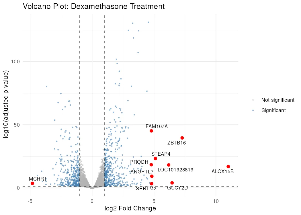
The dashed lines mark the thresholds, a two-fold change and an adjusted p-value of 0.05. The blue points past both lines are the genes that pass the combined filter.
MA plot
Section titled “MA plot”The MA plot puts the mean expression on the x axis and the log fold change on the y axis, which is where shrinkage becomes visible. The low-count genes on the left had extreme raw fold changes, and after shrinkage they sit close to zero, because the model has no reason to believe a large change estimated from ten reads.
png("outputs/rnaseq-ma.png", width = 800, height = 600)plotMA(res, ylim = c(-6, 6), main = "Shrunken log2 fold change against mean")dev.off()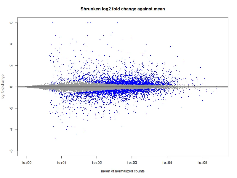
PCA of the samples
Section titled “PCA of the samples”The QC page printed the PCA coordinates. Drawn, they answer a different question: whether the treatment or the donor is the larger source of variation. The shape shows the cell line and the colour shows the treatment.
pca_data <- plotPCA(vsd, intgroup = c("dex", "cell"), returnData = TRUE)percent_var <- round(100 * attr(pca_data, "percentVar"))
pca_plot <- ggplot(pca_data, aes(x = PC1, y = PC2, color = dex, shape = cell)) +  geom_point(size = 3) +  labs(    x = paste0("PC1: ", percent_var[1], "% variance"),    y = paste0("PC2: ", percent_var[2], "% variance"),    title = "Variance-stabilized counts, all genes"  ) +  theme_minimal()
ggsave("outputs/rnaseq-pca.png", pca_plot,       width = 6, height = 5, dpi = 150, bg = "white")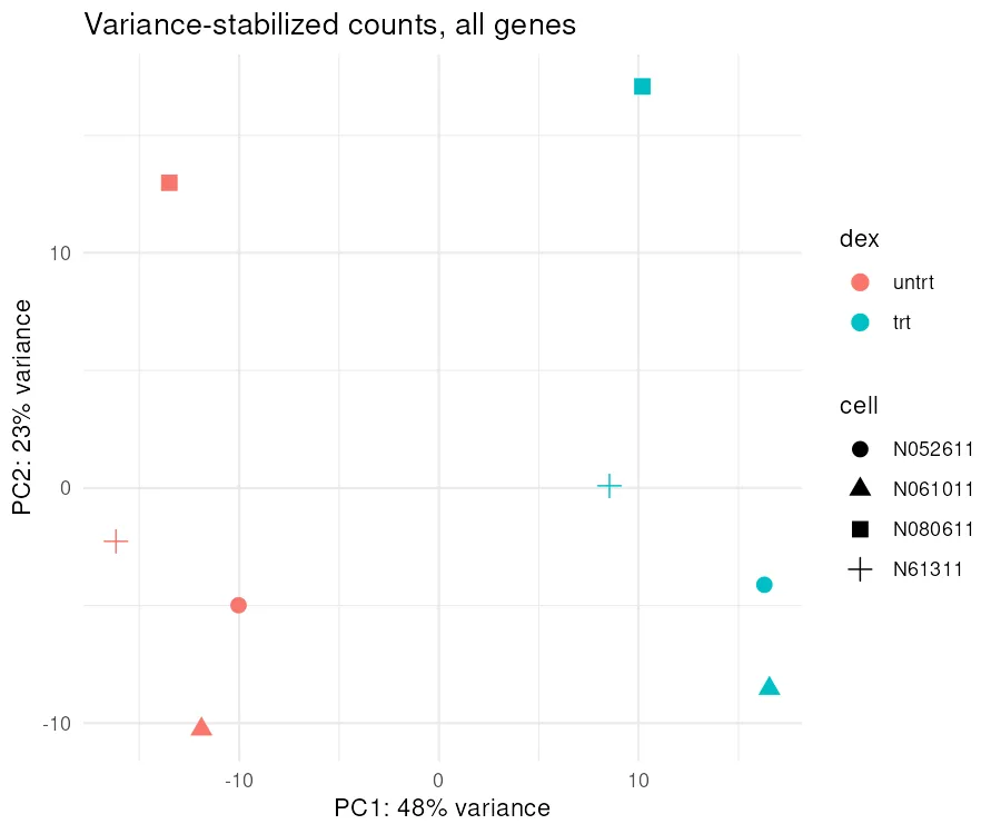
The first axis separates treated from untreated and the second separates the donors, which is what the design formula assumed when it fitted the cell line before the treatment.
The percentages here do not match the ones the QC page printed, and
the reason is the transform rather than the data. That page ran vst(blind = TRUE) for an
unsupervised look, and this one runs blind = FALSE, which lets the design inform the
variance estimate. The samples sit in the same arrangement either way.
Heatmap of the top genes
Section titled “Heatmap of the top genes”The heatmap shows the top 30 genes by adjusted p-value across the eight samples, scaled by row so the comparison is per gene. The column annotation splits treated from untreated, and the genes should sort into two blocks if the treatment moved a coherent set.
library(pheatmap)
# Top 30 genes by adjusted p-value.top30 <- results_df |>  filter(!is.na(padj)) |>  slice_min(padj, n = 30) |>  pull(gene_id)
heatmap_data <- assay(vsd)[top30, ]
# Symbol labels for the rows.top30_symbols <- gene_symbols |>  filter(ENSEMBL %in% top30) |>  deframe()rownames(heatmap_data) <- ifelse(  rownames(heatmap_data) %in% names(top30_symbols),  top30_symbols[rownames(heatmap_data)],  rownames(heatmap_data))
annotation_col <- as.data.frame(colData(dds)[, c("dex", "cell")])
# Draw to a file so the call runs headless.png("outputs/rnaseq-heatmap.png", width = 800, height = 600)pheatmap(  heatmap_data,  scale = "row",  annotation_col = annotation_col,  show_rownames = TRUE,  fontsize_row = 8,  main = "Top 30 Differentially Expressed Genes")dev.off()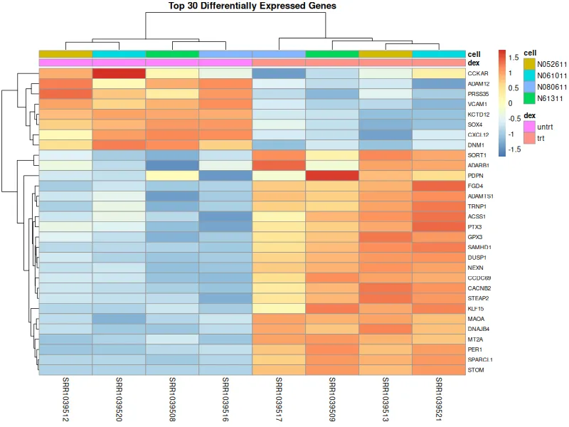
The heatmap and the volcano plot are the two figures a methods section expects from a differential expression run, and both come from the same results object. The enrichment page takes the same object and asks which biological terms the listed genes share.