Raincloud Plot
A box plot reports five numbers. Two hinges, a median, two whisker ends. Everything else about the distribution is discarded, and the reader has no way to tell what was lost. Usually nothing important was. Sometimes the thing you most needed to see is exactly what went.
A raincloud puts it back. Three layers on one axis: a half-violin for the shape, the
cloud; a narrow box for the summary; a strip of jittered points for the raw values,
the rain. Allen and colleagues named the figure in 2019, and it has been quietly
replacing the bar-with-error-bar ever since. R uses ggrain, Python uses
ptitprince. Both run in the pinned figextra container, and both figures below come
from those runs.
The data
Section titled “The data”bimodal_response.csv is 120 samples per group, a target inhibition readout for two
compounds. It is a constructed fixture, and it is constructed to make one point.
- Compound A is a single broad hump. A wide range of response, one typical value.
- Compound B is a responder and non-responder split, plus a spread of intermediate responses. Two tight sub-populations near 36% and 64% inhibition, and a wide low background between and around them.
Compound A was then fitted to compound B’s five box statistics. The two box plots do not merely resemble each other, they coincide: both groups have Q1 36.41, median 50.00, Q3 63.59 and whiskers at 14.79 and 85.21, agreeing to floating point. A box plot of this data says the two compounds behave identically. They do not.
That third component is doing real work, and not only for realism. Two tight sub-populations on their own put a quartile on each mode, which makes the group’s IQR cover half its range, and no single-humped distribution is that wide in the middle. The background buys range without touching the peaks, which is what lets compound A match the box while the modes stay nine standard deviations apart. A shallower split survives in the cloud, because a kernel density amplifies it, but 120 jittered points cannot show a 20% density difference. They can show this one.
What the box plot cannot say
Section titled “What the box plot cannot say”library(ggplot2)library(ggrain) # geom_rain: all three layers in one calllibrary(patchwork) # the side-by-side panel
palette <- c(compound_a = "#3B6DB3", compound_b = "#C1432B")
df <- as.data.frame(readr::read_csv("../fixtures/bimodal_response.csv", show_col_types = FALSE))df$group <- factor(df$group, levels = c("compound_a", "compound_b"))
base <- ggplot(df, aes(x = group, y = inhibition_pct, fill = group)) + scale_fill_manual(values = palette) + scale_colour_manual(values = palette) + coord_cartesian(ylim = range(df$inhibition_pct) + c(-4, 4)) + labs(x = NULL, y = "Target inhibition (%)") + theme_classic(base_size = 12) + theme(legend.position = "none")
p_box <- base + geom_boxplot(width = 0.55, outlier.shape = NA, alpha = 0.9) + ggtitle("Box plot")
# geom_rain() draws the half-violin, the box and the jittered points together.p_rain <- base + geom_rain(alpha = 0.6, point.args = list(alpha = 0.45, size = 0.9, shape = 21, stroke = 0.2), # ggrain's default rain is a narrow strip, which # stacks points into a # line and hides the very density difference the figure is about. point.args.pos = list(position = position_jitter(width = 0.11, height = 0)), boxplot.args = list(width = 0.1, outlier.shape = NA, alpha = 0.9, colour = "black")) + ggtitle("Raincloud")
# SUBTITLE is built earlier in the script. It quotes the shared box statistics# when the fit landed on an exact match and the size of the gap when it did not,# so the figure never asserts a match it does not have.panel <- (p_box | p_rain) + plot_annotation(title = "Same data, two figures", subtitle = SUBTITLE)
ggsave("outputs/box-vs-raincloud-r.png", panel, width = 8.0, height = 4.2, dpi = 200, bg = "white")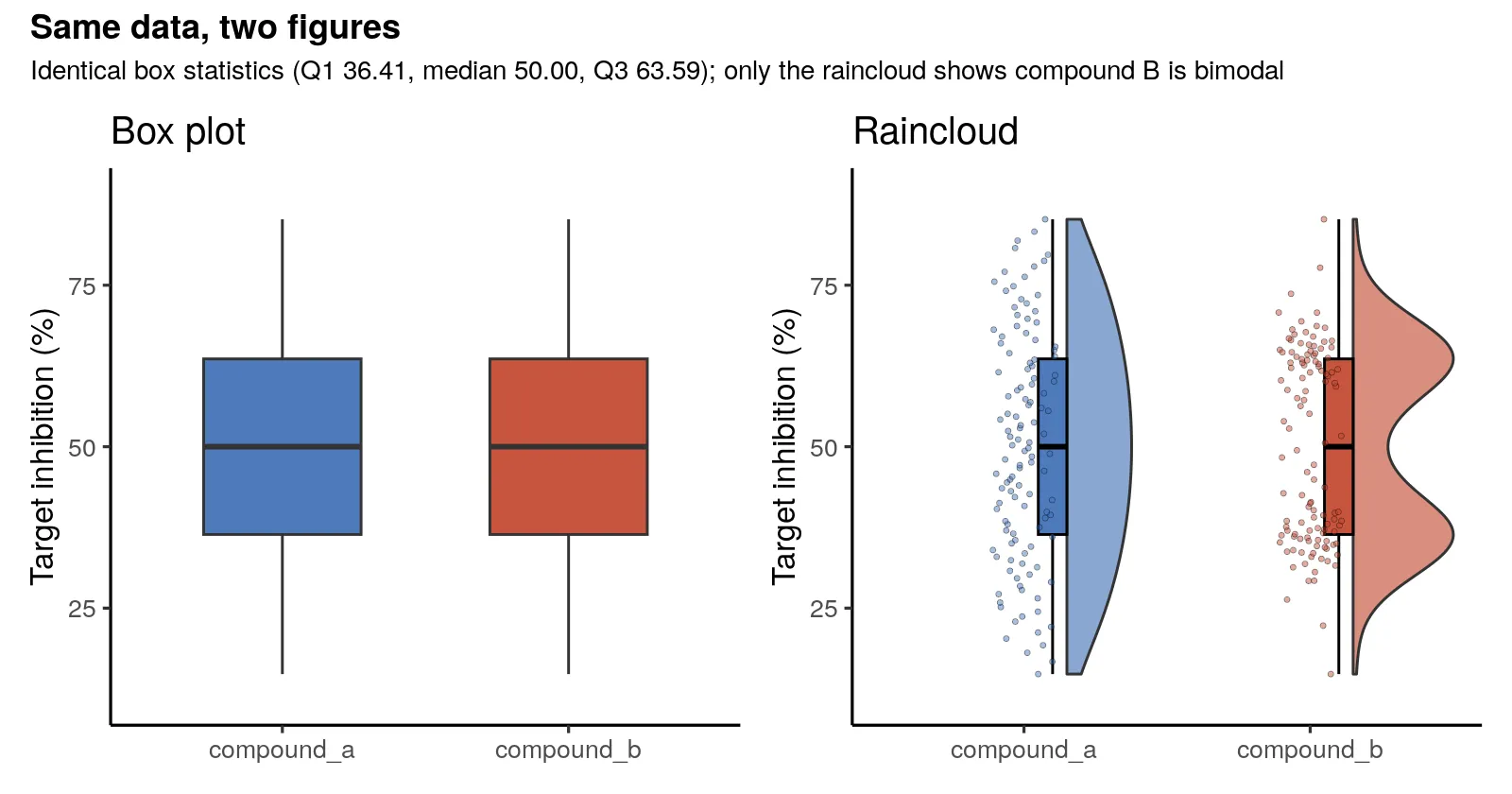
import matplotlib.pyplot as pltimport pandas as pd, seaborn as snsimport ptitprince as pt
PAL = {"compound_a": "#3B6DB3", "compound_b": "#C1432B"}ORDER = ["compound_a", "compound_b"]
df = pd.read_csv("../fixtures/bimodal_response.csv")# RainCloud passes palette straight into seaborn, so it wants a LIST that lines# up with order. A dict raises from deep inside seaborn.pal_list = [PAL[g] for g in ORDER]
fig, (ax_box, ax_rain) = plt.subplots(1, 2, figsize=(8.0, 4.2), sharey=True)
sns.boxplot(    data=df,    x="group",    y="inhibition_pct",    hue="group",    order=ORDER,    palette=PAL,    legend=False,    width=0.55,    fliersize=0,    ax=ax_box,)ax_box.set_title("Box plot")
pt.RainCloud(    x="group",    y="inhibition_pct",    data=df,    ax=ax_rain,    palette=pal_list,    order=ORDER,    width_viol=0.7,    width_box=0.12,    move=0.2,    alpha=0.6,    point_size=1.2,)# move= pushes the rain right without widening the axis, so the last group's# points fall off the edge. Give them the room.ax_rain.set_xlim(-0.6, len(ORDER) - 1 + 0.8)ax_rain.set_title("Raincloud")
# SUBTITLE is built earlier in the script. It quotes the shared box statistics# when the fit landed on an exact match and the size of the gap when it did not.fig.suptitle("Same data, two figures", fontsize=13, fontweight="bold", y=1.01)fig.text(0.5, 0.945, SUBTITLE, ha="center", fontsize=9)fig.savefig("outputs/box-vs-raincloud-python.png", dpi=200, bbox_inches="tight")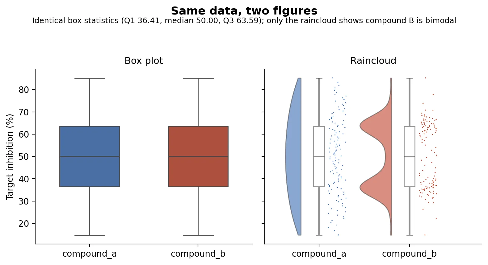
The left panel is the figure most papers would print. Two compounds, same median, same spread, no difference worth reporting. The right panel is the same numbers, and compound B is obviously two populations. Most samples sit in one cluster or the other, and the median lands in the thin band between them, where hardly any sample actually is. The rain says it as plainly as the cloud does: two dense bands of points with a gap across the middle.
That failure mode is not exotic. Responder and non-responder splits, two cell states, a batch that behaved differently, a mixed population of cells: all of them are bimodal, and all of them survive a box plot untouched. The box plot is not wrong. It answers a question about quartiles, correctly, and a reader assumes it answered a question about shape.
The raincloud on its own
Section titled “The raincloud on its own”base + geom_rain(alpha = 0.6, point.args = list(alpha = 0.5, size = 1.1, shape = 21, stroke = 0.2), point.args.pos = list(position = position_jitter(width = 0.11, height = 0)), boxplot.args = list(width = 0.1, outlier.shape = NA, alpha = 0.9, colour = "black")) + labs( title = "Raincloud: response to two compounds", subtitle = paste( "Half-violin (cloud) + box (summary) + jittered points (rain)" ) )
fig, ax = plt.subplots(figsize=(5.0, 4.4))pt.RainCloud( x="group", y="inhibition_pct", data=df, ax=ax, palette=pal_list, order=ORDER, width_viol=0.7, width_box=0.12, move=0.2, alpha=0.6, point_size=1.5,)ax.set_xlim(-0.6, len(ORDER) - 1 + 0.8)ax.set(xlabel="", ylabel="Target inhibition (%)")ax.set_title( "Raincloud: response to two compounds\n" "Half-violin (cloud) + box (summary) + jittered points (rain)", fontsize=10, loc="left",)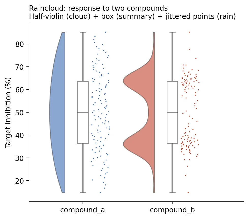
The two layouts differ. ggrain puts the cloud on the right of the box and the rain on
the left; ptitprince spreads cloud, box and rain across three positions. Both are
valid readings of the same idea, and neither library is trying to match the other.
What the two engines agree on
Section titled “What the two engines agree on”The figures are drawn each library’s way, so they are not pixel twins. The numbers under them are checked. Both engines compute the box statistics with the same rule, R’s type-7 quantile and numpy’s default linear percentile being the same interpolation, and they return identical values: Q1 36.41, median 50.00, Q3 63.59, whiskers 14.79 to 85.21, for both groups.
Both also count the humps, on a Gaussian kernel density over a grid covering the data, with Silverman’s bandwidth computed from the same formula in each language so the two evaluate the same function: compound A has one mode, compound B has two, and the density falls 54.6% from the lower peak to the valley between them. R and Python agree on that percentage to within 4e-11. It is the claim the figure makes, computed rather than asserted, and the build gate fails if the two languages ever stop agreeing on it.
Choosing the bandwidth by a rule rather than by eye is not decoration. An earlier version of this page fixed it at 3, which is narrower than the gap between points out in the sparse tails, so the density resolved single points as their own bumps and reported four modes for a distribution that has two. Silverman’s rule scales with the spread and the sample size, and that is what stops it.
Making it publication-ready
Section titled “Making it publication-ready”- Reach for a raincloud whenever n is small enough to draw. Below roughly 50 points per group there is no reason to hide them, and a reviewer who can count your samples trusts the figure more.
- Keep the box. The raincloud is not an argument against summary statistics, it is an argument against showing only summary statistics. Median and IQR still belong on the figure.
- Watch the violin bandwidth in both directions. Over-smooth and you erase the split you
drew the figure to show. Under-smooth and isolated points in the tails become modes
that are not there. If a mode appears or vanishes when you change
adjust, say what bandwidth you used. - Do not raincloud everything. With thousands of points the rain becomes a smear and a violin alone reads better. This figure earns its place in the tens-to-hundreds range.
- Check for bimodality before you choose the figure, not after. If a group is two populations, a t-test on it is answering a question nobody asked.
The runnable scripts, the fixture generator, and the container are in the companion
code repo under guides/figures/raincloud/.