Correlation
Correlation measures how strongly two numeric variables move together. In bioinformatics it shows up everywhere: co-expressed genes, a marker against a phenotype, a technical variable against a biological one. This page correlates two co-expressed genes, in R and Python.
Every code block on this page runs in a container in the companion repository. The numbers and figure come from those real runs.
When to use Pearson or Spearman
Section titled “When to use Pearson or Spearman”- Pearson measures the strength of a straight-line relationship. Use it when both variables are roughly normal and the relationship looks linear.
- Spearman works on ranks. It captures any monotonic relationship, resists outliers, and does not need normality. It is the safer default for skewed expression data.
The data
Section titled “The data”coexpression.csv has 60 samples with two gene expression values, gene_x and
gene_y.
df <- read.csv("coexpression.csv")import pandas as pd
df = pd.read_csv("coexpression.csv")Always plot the two variables before you trust a correlation number. A scatter with
a fitted line shows the strength and the shape at a glance. We print the coefficient
and p-value on the plot: ggpubr::stat_cor in R, a text annotation in Python.
library(ggpubr)  # ggscatter builds the plot; stat_cor adds R and the p-value
ggscatter(df, x = "gene_x", y = "gene_y", add = "reg.line", conf.int = TRUE) +  stat_cor(method = "pearson", p.accuracy = 0.001, r.accuracy = 0.01)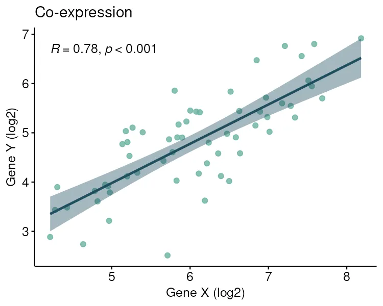
import seaborn as sns
ax = sns.regplot(data=df, x="gene_x", y="gene_y")ax.text(0.05, 0.95, f"R = {r:.2f}, p < 0.001", transform=ax.transAxes, va="top")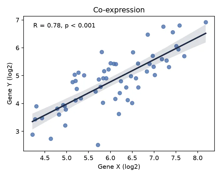
Pearson correlation
Section titled “Pearson correlation”Pearson’s r runs from -1 to 1. Values near 1 mean a strong positive linear relationship, near -1 a strong negative one, near 0 no linear relationship.
cor.test(df$gene_x, df$gene_y, method = "pearson") Pearson's product-moment correlationt = 9.4079, df = 58, p-value = 2.835e-1395 percent confidence interval: 0.6520083 0.8612052sample estimates: cor0.7772506from scipy import stats
stats.pearsonr(df["gene_x"], df["gene_y"])Pearson: r = 0.777, p = 2.835e-13Both give r = 0.777 with a tiny p-value. The two genes are strongly, positively correlated. Squaring r gives r-squared of about 0.60, so gene X explains roughly 60% of the variation in gene Y.
Spearman correlation
Section titled “Spearman correlation”Spearman correlates the ranks instead of the raw values. It captures any monotonic trend and shrugs off outliers and skew.
cor.test(df$gene_x, df$gene_y, method = "spearman") Spearman's rank correlation rhoS = 7925.6, p-value = 2.114e-13sample estimates: rho0.779783stats.spearmanr(df["gene_x"], df["gene_y"])Spearman: rho = 0.780, p = 2.114e-13Spearman’s rho of 0.78 agrees with Pearson’s r. When the two match, the relationship is both strong and close to linear.
Pitfalls and bioinformatics notes
Section titled “Pitfalls and bioinformatics notes”- Correlation is not causation. A strong r says two variables move together, not that one drives the other. A hidden batch effect can correlate anything.
- Always plot first. Two scatters with completely different shapes can share the same r. A single outlier can create or destroy a Pearson correlation.
- Pearson assumes linearity. A strong curved relationship can give a Pearson r near zero. Spearman catches monotonic curves; neither catches a U shape.
- r-squared, not r, is the variance explained. An r of 0.5 explains only 25% of the variance, not half.
Key points
Section titled “Key points”- Pearson measures linear strength; Spearman measures monotonic strength on ranks.
- Both run from -1 to 1. Square Pearson’s r to get the variance explained.
- Plot the scatter before trusting any correlation number.
- Correlation never proves causation.
Further reading
Section titled “Further reading”- STHDA, correlation analysis and correlation test.
- The next guide, Simple linear regression, which models the line through the scatter.