Kaplan-Meier Survival
A survival figure carries three things a reviewer looks for: the step curves, the log-rank p-value, and the number still at risk under the x-axis. Drop the risk table and the curves at the right edge become impossible to trust, because you cannot tell whether a flat tail rests on forty patients or four.
This page draws the full figure for a two-arm trial with right-censored follow-up. R
uses survminer, which produces the curves, the table, and the p-value in one call.
Python uses lifelines. Both run in the pinned pubplot container and return the
same log-rank p.
The data
Section titled “The data”survival_trial.csv has one row per patient: time in months, event coded 1 for
the event and 0 for censored, and arm. Sixty patients per arm. The treated arm
survives longer.
Curves, p-value, risk table
Section titled “Curves, p-value, risk table”The tick marks are censored patients. event = 0 means the patient left the study
before the event, and marking them is what separates an honest survival curve from a
line that pretends everyone was followed to the end.
library(survival)library(survminer)library(ggpubr)
df$arm <- factor(df$arm, levels = c("control", "treated"))fit <- surv_fit(Surv(time, event) ~ arm, data = df)
g <- ggsurvplot(fit, data = df, pval = TRUE, risk.table = TRUE,  conf.int = FALSE,                censor = TRUE, palette = c("#3B6DB3", "#C1432B"),                legend.title = "Arm", legend.labs = c("control", "treated"),                xlab = "Months", ylab = "Survival probability",                ggtheme = theme_classic(base_size = 13),                tables.theme = theme_cleantable())
# ggsurvplot returns the curve and the table as separate ggplots; stack them.ggarrange(g$plot, g$table, ncol = 1, nrow = 2, heights = c(0.74, 0.26),  align = "v")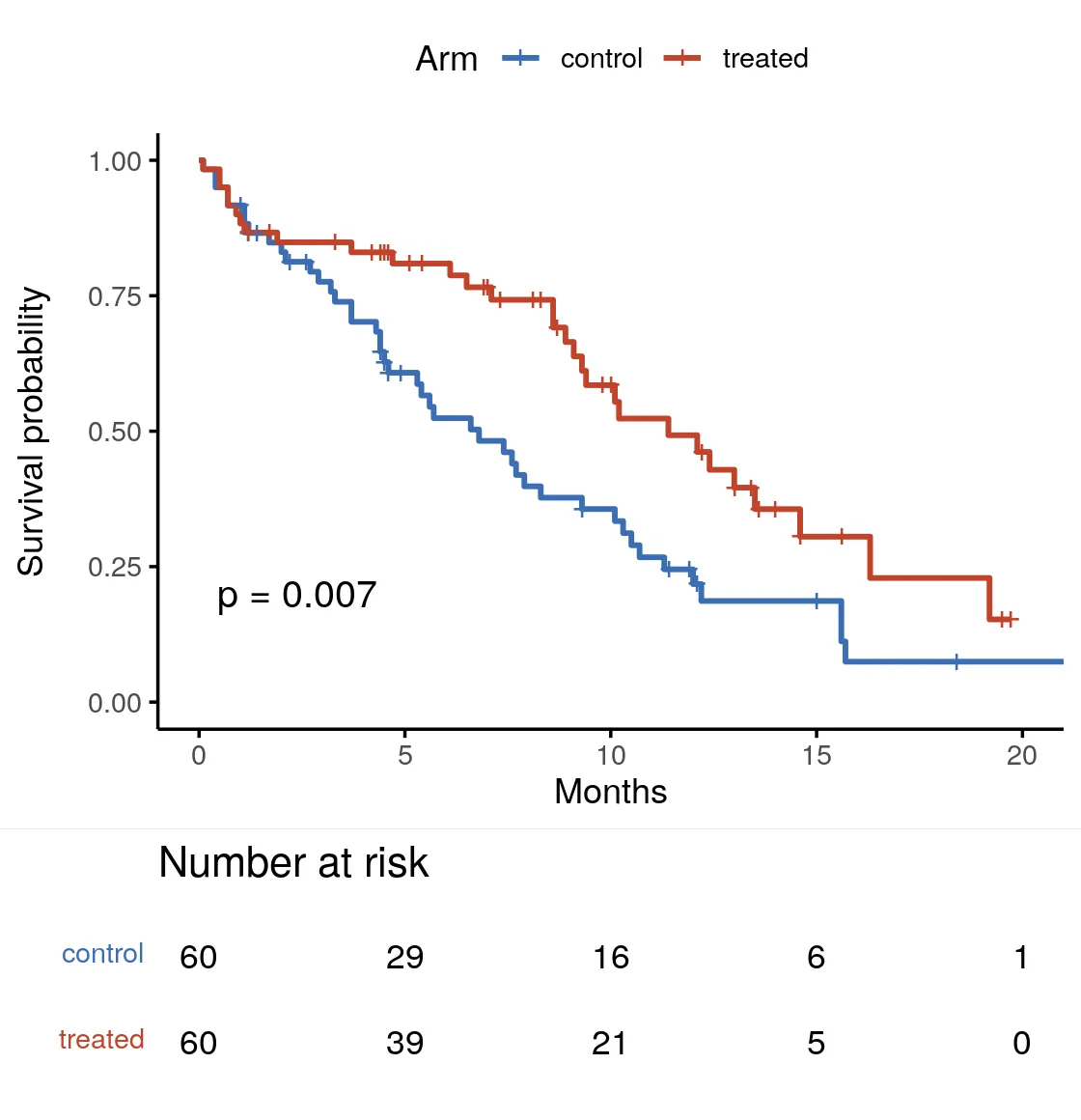
import matplotlib.pyplot as pltimport pandas as pdfrom lifelines import KaplanMeierFitterfrom lifelines.plotting import add_at_risk_countsfrom lifelines.statistics import multivariate_logrank_test
order, pal = ["control", "treated"], ["#3B6DB3", "#C1432B"]fig, ax = plt.subplots(figsize=(5.6, 5.8))
fitters = []for color, grp in zip(pal, order):    sub = df[df["arm"] == grp]    kmf = KaplanMeierFitter().fit(sub["time"], sub["event"], label=grp)    kmf.plot_survival_function(        ax=ax,        ci_show=False,        color=color,        show_censors=True,        censor_styles={            "marker": "|",            "ms": 6        },    )    fitters.append(kmf)
p = multivariate_logrank_test(df["time"], df["arm"], df["event"]).p_valueax.text(0.04,        0.08,        f"log-rank p = {p:.2g}",        transform=ax.transAxes,        fontsize=11)add_at_risk_counts(*fitters, ax=ax)  # the table under the axis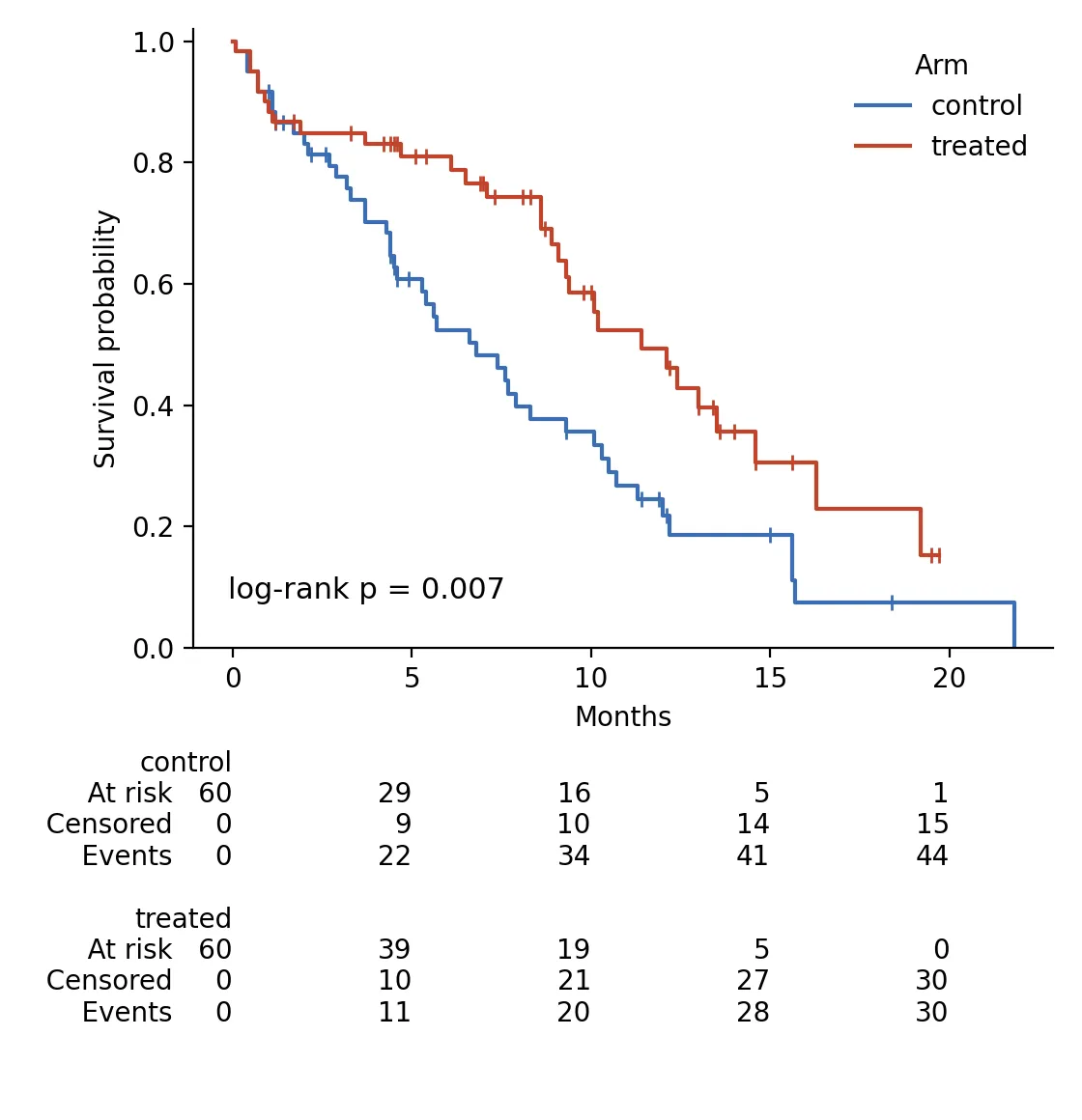
Both engines return log-rank p = 0.007. The one visible difference is the table.
survminer prints number at risk only; lifelines adds censored and event counts by
default, which is more information in the same space. Neither is wrong; pick the one
your journal expects.
Making it publication-ready
Section titled “Making it publication-ready”- Always show the risk table. A survival curve without it is not publishable in most clinical journals, and for good reason.
- Mark the censored patients. The tick marks tell the reader the tail is real, not extrapolated.
- Put the log-rank p on the plot, not only in the caption. It is the headline result.
- Do not extend the x-axis past the last informative time. When the smaller arm drops to one or two at risk, the curve past that point is noise.
For an adjusted comparison, a hazard ratio from a Cox model rather than a raw log-rank
test, see the Cox forest plot. The runnable scripts and
fixture are in the companion code repo under guides/figures/kaplan-meier/.