Dimensionality Reduction
Load, filter and select genes
Section titled “Load, filter and select genes”import numpy as npimport scanpy as scimport matplotlib.pyplot as plt
sc.settings.verbosity = 3np.random.seed(42)
adata = sc.read_10x_mtx("/opt/data/pbmc3k", var_names="gene_symbols", make_unique=True)adata.layers["counts"] = adata.X.copy()adata.var["mt"] = adata.var_names.str.startswith("MT-")sc.pp.calculate_qc_metrics(adata, qc_vars=["mt"], percent_top=None, log1p=False, inplace=True)
def is_outlier(adata, metric, nmads): """Flag cells whose metric sits more than nmads MADs from the median.
Args: adata: AnnData object holding the metric in .obs. metric: Column of adata.obs to test. nmads: Number of median absolute deviations for the cutoff.
Returns: Boolean Series, True where the cell is an outlier. """ values = adata.obs[metric] median = values.median() mad = (values - median).abs().median() return (values < median - nmads * mad) | (values > median + nmads * mad)
adata.obs["log1p_total_counts"] = np.log1p(adata.obs["total_counts"])adata.obs["log1p_n_genes_by_counts"] = np.log1p( adata.obs["n_genes_by_counts"])adata.obs["outlier"] = ( is_outlier(adata, "log1p_total_counts", 5) | is_outlier(adata, "log1p_n_genes_by_counts", 5) | is_outlier(adata, "pct_counts_mt", 3))adata = adata[~adata.obs["outlier"]].copy()sc.pp.filter_genes(adata, min_cells=3)
sc.pp.normalize_total(adata, target_sum=1e4)sc.pp.log1p(adata)sc.pp.highly_variable_genes(adata, layer="counts", n_top_genes=2000, flavor="seurat_v3")adata.raw = adataadata = adata[:, adata.var["highly_variable"]]print(adata.shape)(2428, 2000)sc.pp.scale(adata, max_value=10)
# Run PCA.sc.tl.pca(adata, n_comps=50, random_state=42)
ratio = adata.uns["pca"]["variance_ratio"]print("first five variance ratios:", np.round(ratio[:5], 4))cumulative = np.cumsum(ratio)print("cumulative at 10, 20, 30 components:", np.round(cumulative[[9, 19, 29]], 4))first five variance ratios: [0.0305 0.0117 0.0081 0.0054 0.004 ]cumulative at 10, 20, 30 components: [0.0718 0.09 0.1072]# The elbow plot, to choose the number of components to carry forward.# Fifty component labels need a wide figure to stay readable.sc.pl.pca_variance_ratio(adata, n_pcs=50, show=False)plt.gcf().set_size_inches(12, 4)plt.savefig("outputs/dimensionality-reduction_elbow.png", dpi=150, bbox_inches="tight")plt.close()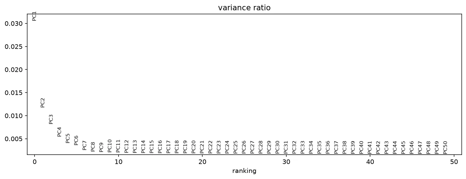
sc.pl.pca(adata, color="total_counts", show=False)plt.savefig("outputs/dimensionality-reduction_pca.png", dpi=150, bbox_inches="tight")plt.close()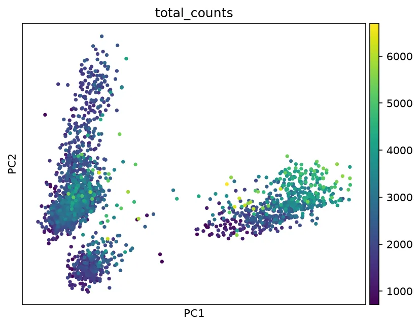
The neighbor graph and UMAP
Section titled “The neighbor graph and UMAP”# Build the neighbor graph on 30 components, then embed it with UMAP.sc.pp.neighbors(adata, n_neighbors=15, n_pcs=30, random_state=42)sc.tl.umap(adata, random_state=42)print(adata.obsm["X_umap"].shape)(2428, 2)sc.pl.umap(adata, color="total_counts", show=False)plt.savefig("outputs/dimensionality-reduction_umap.png", dpi=150, bbox_inches="tight")plt.close()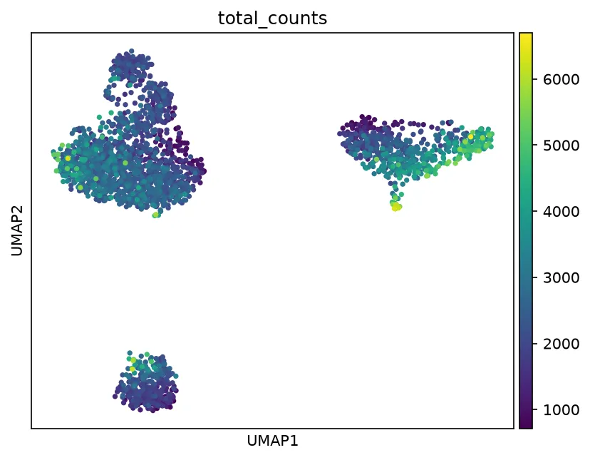
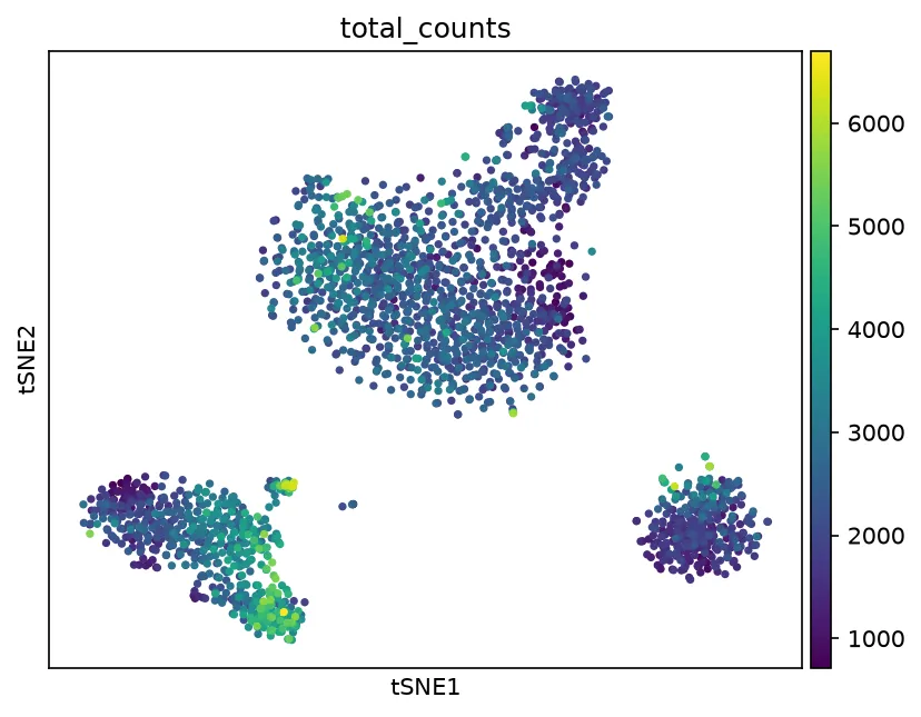
# t-SNE preserves local neighborhoods more strongly than UMAP and# distorts global distances more, so it suits looking for tight# subpopulations rather than overall layout.sc.tl.tsne(adata, n_pcs=30, random_state=42)print(adata.obsm["X_tsne"].shape)(2428, 2)sc.pl.tsne(adata, color="total_counts", show=False)plt.savefig("outputs/dimensionality-reduction_tsne.png", dpi=150, bbox_inches="tight")plt.close()