Harmonisation
Two analysts gate the same file and report different population frequencies. The difference is not biology. It is the gate, drawn by hand at a different place on the biaxial plot. The harmonisation question is how much of the spread in a published flow result comes from the analyst, and what a centralised analysis, one gate applied by code to every file, removes.
The source of the spread
Section titled “The source of the spread”The FlowRepository deposit FR-FCM-Z282 is the one dataset that can measure this, because
it is the one deposit where many people gated the same files and every answer was
published. Thirteen operators at five centres stained and acquired the same six samples
on seven instruments, one reference operator re-analysed all 234 files, and the spread
between the two answers for a file is the analyst variation. The
everything-flow-cytometry repository’s harmonisation report runs the full analysis on
that deposit. The example
here uses the bundled Bodenmiller data to show the mechanism: the same population,
gated at two different cut points, gives two different frequencies.
library(flowCore)library(HDCytoData)
# Load and arcsinh-transform the surface CD markers (cofactor 5).fs <- Bodenmiller_BCR_XL_flowSet()channels <- colnames(fs[[1]])cd_markers <- grep("^CD", channels, value = TRUE)asinh_trans <- arcsinhTransform(a = 0, b = 1 / 5, c = 0)fs <- transform(fs, transformList(cd_markers, tfun = asinh_trans))frame <- fs[[1]]cd3 <- grep("^CD3\\(", channels, value = TRUE)[1]cd3
# The frequency of positive events at a given threshold.#' Frequency of events above a threshold on one marker.#'#' @param frame A `flowFrame`.#' @param marker The channel name to gate on.#' @param threshold The lower bound of the positive region.#' @return The fraction of events above the threshold.PositiveFrequency <- function(frame, marker, threshold) {  gate <- rectangleGate(    filterId = "positive",    .gate = setNames(list(c(threshold, Inf)), marker)  )  pos <- Subset(frame, gate)  nrow(exprs(pos)) / nrow(exprs(frame))}
# Two analysts, two cut points on the same marker.PositiveFrequency(frame, cd3, 2.0)PositiveFrequency(frame, cd3, 2.5)
[1] "CD3(110:114)Dd"[1] 0.6504581[1] 0.5331219The two numbers differ by the fraction of events that sit between the two cut points. That fraction is the analyst variation. On a real marker with a clear positive and negative population it is small. On a marker with a continuous distribution it is large, and it is exactly the marker where hand-drawn gates disagree most.
A centralised gate
Section titled “A centralised gate”The fix is to fix the gate. One threshold, chosen once from a control, applied by code to every file, removes the analyst from the result. The frequency that remains is the biology plus the instrument variation, and the instrument variation is the same for every analyst because no analyst touched it.
# One centralised threshold, applied to every file in the set.centralised_threshold <- 2.0frequencies <- vapply(seq_len(length(fs)), function(i) { PositiveFrequency(fs[[i]], cd3, centralised_threshold)}, numeric(1))round(frequencies, 3) [1] 0.650 0.603 0.695 0.644 0.490 0.443 0.477 0.458 0.594 0.542 0.665 0.654[13] 0.518 0.496 0.628 0.619The spread across files is now the biological and instrument spread, not the analyst spread. The point is not that 2.0 is the right threshold. It is that the threshold is the same for every file and every analyst, so the comparison between files is fair.
The two cuts, drawn
Section titled “The two cuts, drawn”The two thresholds are half a unit apart on a transformed axis. Drawn on the distribution they are cutting, the size of the disagreement stops being abstract.
library(ggplot2)
dir.create("outputs", showWarnings = FALSE, recursive = TRUE)
cd3_values <- data.frame(cd3 = exprs(frame)[, cd3])
cut_plot <- ggplot(cd3_values, aes(x = cd3)) +  geom_density(fill = "grey80", colour = "grey40") +  geom_vline(xintercept = 2.0, colour = "steelblue", linewidth = 0.8) +  geom_vline(xintercept = 2.5, colour = "firebrick", linewidth = 0.8) +  labs(    title = "Two analysts, two cut points on the same CD3 distribution",    x = "CD3, arcsinh", y = "density"  ) +  theme_minimal()
ggsave("outputs/cyto-two-cuts.png", plot = cut_plot,       width = 7, height = 4, dpi = 110, bg = "white")
# The centralised threshold across every file in the set.spread <- data.frame(frequency = frequencies)
spread_plot <- ggplot(spread, aes(x = frequency, y = "")) +  geom_point(size = 3, alpha = 0.7, colour = "steelblue") +  labs(    title = "One threshold, sixteen files",    x = "CD3 positive fraction", y = NULL  ) +  theme_minimal()
ggsave("outputs/cyto-threshold-spread.png", plot = spread_plot,       width = 7, height = 2.5, dpi = 110, bg = "white")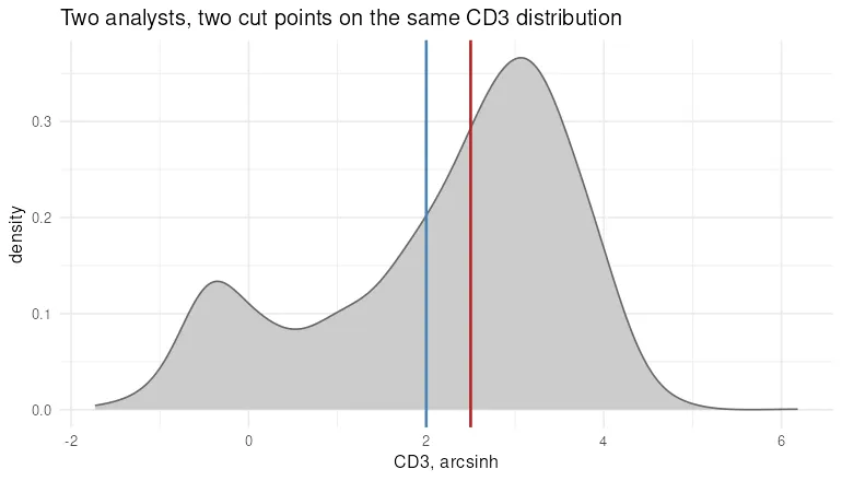
Both lines land on the shoulder of the distribution rather than in a gap. That is the whole problem. Where the density is high, a small movement of the boundary reclassifies a large number of events, which is how half a unit of analyst preference becomes twelve points of reported frequency.
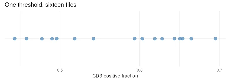
The spread that remains under one common threshold is biological and technical variation between the files, and the numbers say which. The sixteen files are eight patients measured twice, stimulated and reference, in that order. Each patient’s pair sits close together, 0.650 against 0.603 for the first and 0.695 against 0.644 for the second, while across patients the fraction runs from 0.443 to 0.695. The donor moves this number far more than the stimulation does.
That residual spread is what a study wants to report. The spread an analyst adds on top of it, twelve points from half a unit of threshold preference, is the part harmonisation removes.
What harmonisation does and does not fix
Section titled “What harmonisation does and does not fix”A centralised gate removes the analyst variation. It does not remove the instrument variation, the panel design variation, or the compensation variation, which come from different cytometers and different antibody lots. Those need bead-based normalisation and reference controls, a larger subject. What the centralised gate does is the cheapest and largest single fix: it takes the person out of the loop, and the person is the largest single source of spread in a multi-analyst flow result.