UpSet Plot
A Venn diagram works for two sets and just about survives three. At five it has 31 regions, most of them slivers, and no reader can compare two areas that shape. The question has not changed, though. Which genes did more than one assay find, and which did only one.
An UpSet plot answers it by giving up on the geometry. Intersections become a bar
chart, sorted by size. Which sets make up each intersection becomes a matrix of filled
dots below it. Set totals get their own bars on the side. Lex and colleagues introduced
it in 2014, and it scales to about twenty sets before it too runs out of room. R uses
ComplexUpset, Python uses upsetplot. Both run in the pinned figextra container.
The data
Section titled “The data”gene_set_membership.csv is 60 cancer genes with binary membership across five assays:
differential expression from bulk RNA-seq, differential abundance from mass
spectrometry, transcription factor binding from ChIP-seq, genome-wide significant GWAS
loci, and single-cell cluster markers.
The membership is constructed, not measured, and the page draws no biology from it. It is built in blocks, because that is what real multi-omics data looks like and random membership is not. Platforms agree with each other in groups: a small core that every assay found, a large block where transcript and protein agree, a regulatory block where ChIP-seq and GWAS overlap while expression does not move, and genes only one platform ever saw. Scatter 60 genes at random across five sets instead and you get thirty bars of height one, nothing to rank and nothing to read.
Intersections as a ranked bar chart
Section titled “Intersections as a ranked bar chart”library(ggplot2)library(ComplexUpset)
set_names <- c("RNAseq_DEG", "Proteomics", "ChIPseq_Targets", "GWAS_Hits", "scRNAseq_Markers")palette <- c(RNAseq_DEG = "#C1432B", Proteomics = "#3B6DB3", ChIPseq_Targets = "#2A9D8F", GWAS_Hits = "#E9C46A", scRNAseq_Markers = "#E07A5F")
genes <- as.data.frame(readr::read_csv("../fixtures/gene_set_membership.csv", show_col_types = FALSE))genes[set_names] <- lapply(genes[set_names], as.logical)
# A gene in no set has no intersection to sit in.genes <- genes[rowSums(as.matrix(genes[set_names])) > 0, , drop = FALSE]
# Largest intersection, used to set integer breaks on the bar axis below.max_isize <- max(table(apply(as.matrix(genes[set_names]), 1, function(r) paste(as.integer(r), collapse = ""))))
upset( genes, set_names, name = "Assay", min_size = 1, width_ratio = 0.28, height_ratio = 0.55, sort_intersections_by = "cardinality", sort_sets = "descending", # One query per set colours that set's total bar and its matrix stripe. queries = lapply( set_names, function(set_name) upset_query(set = set_name, fill = unname(palette[set_name])) ), base_annotations = list( "Intersection size" = intersection_size( text = list(size = 3), bar_number_threshold = 1 ) + scale_y_continuous(breaks = seq(0, max_isize + 2, by = 2)) ), set_sizes = upset_set_size() + expand_limits(y = 44))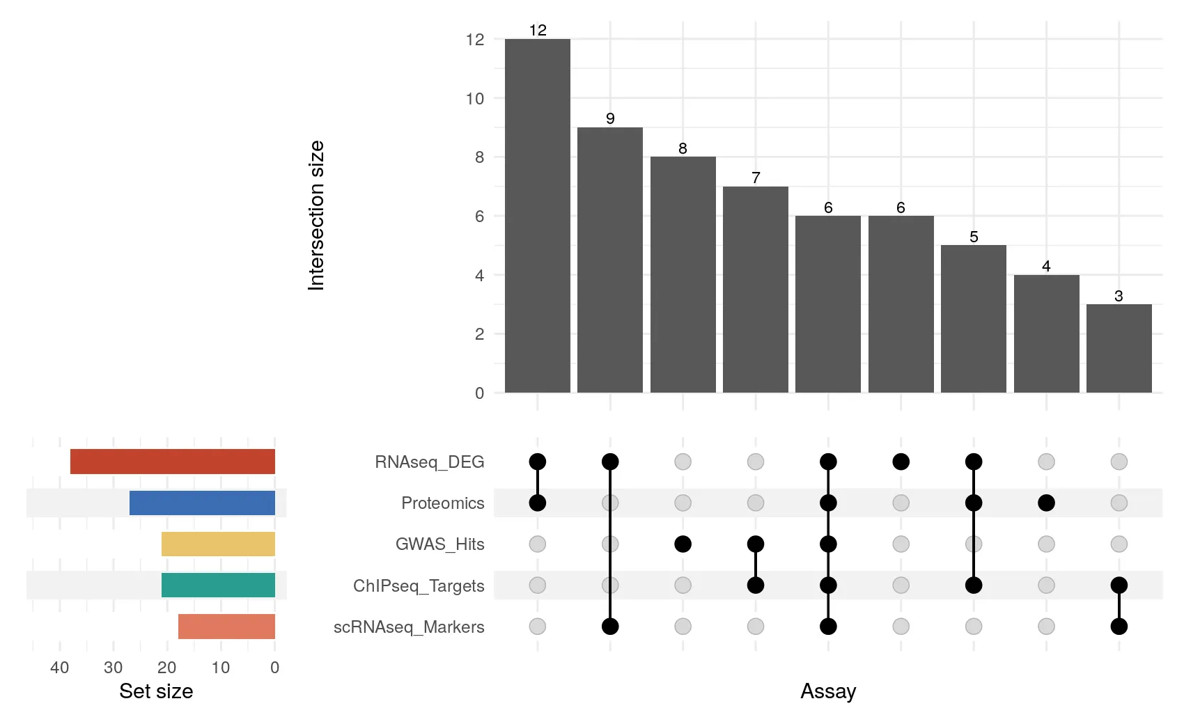
import matplotlib.pyplot as pltimport pandas as pdfrom matplotlib.ticker import MaxNLocatorfrom upsetplot import UpSet, from_indicators
SETS = [    "RNAseq_DEG",    "Proteomics",    "ChIPseq_Targets",    "GWAS_Hits",    "scRNAseq_Markers",]
genes = pd.read_csv("../fixtures/gene_set_membership.csv")genes[SETS] = genes[SETS].astype(bool)genes = genes[genes[SETS].any(axis=1)].reset_index(drop=True)
upset_data = from_indicators(SETS, genes.set_index("gene"))
fig = plt.figure(figsize=(8.5, 5.2))upset = UpSet(    upset_data,    subset_size="count",    show_counts=True,    sort_by="cardinality",    sort_categories_by="cardinality",    facecolor="#3B6DB3",    totals_plot_elements=3,  # narrower set-size panel, so no name is clipped    element_size=None,)axes = upset.plot(fig=fig)
# Counts are integers; the default locator puts half-gene ticks on the axis.axes["intersections"].yaxis.set_major_locator(MaxNLocator(integer=True))axes["totals"].xaxis.set_major_locator(MaxNLocator(integer=True, nbins=3))
fig.savefig("outputs/upset-python.png", dpi=200, bbox_inches="tight")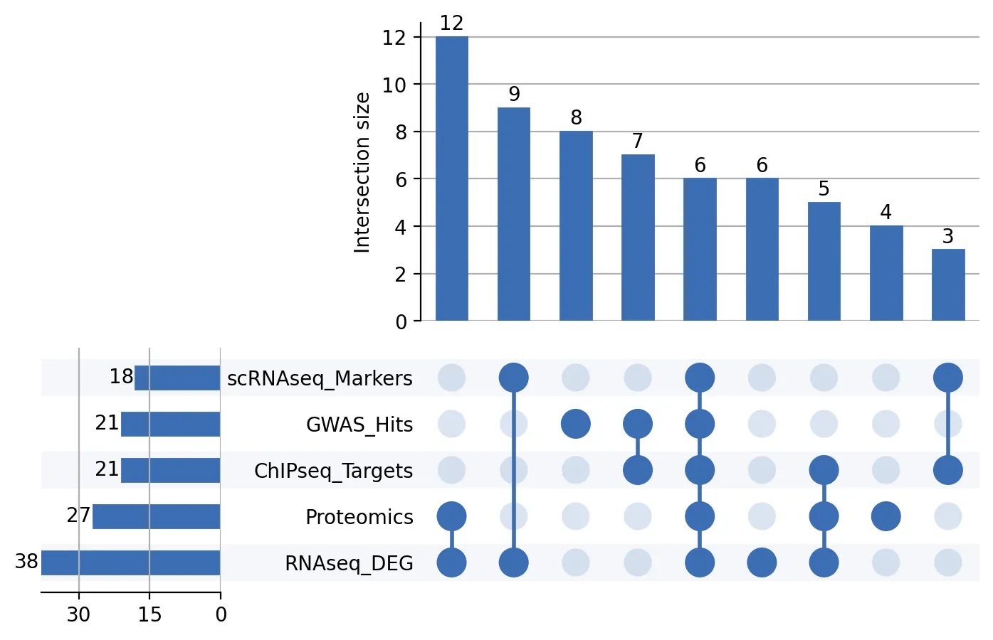
Read it left to right. The tallest bar is the twelve genes that RNA-seq and proteomics both found and nothing else did. Then nine that bulk and single-cell RNA-seq share, then eight that only GWAS ever saw. Six genes carry all five dots, which in a real study is the column you would take to a validation experiment. The ranking is the point: you can order these by size at a glance, which is precisely what a Venn diagram with 31 regions denies you.
Where the two libraries part company
Section titled “Where the two libraries part company”ComplexUpset is built on ggplot2, so every panel is a ggplot object and takes ordinary
ggplot layers. That is where scale_y_continuous above comes from, and it is why
upset_query() can colour each assay independently. upsetplot is built on matplotlib
and returns a dict of axes from plot(), which you then adjust directly. It has no
per-set colouring, so the Python figure takes one accent colour throughout.
Neither is a deficiency. Both are the idiom of their own ecosystem, and the figures are meant to look like what they are.
R, ComplexUpset |
Python, upsetplot |
|
|---|---|---|
| Built on | ggplot2 | matplotlib |
| Sort by size | sort_intersections_by = "cardinality" |
sort_by="cardinality" |
| Drop small intersections | min_size = 2 |
min_subset_size=2 |
| Per-set colour | upset_query(set = ...) |
not available, style manually |
| Extra annotations | any ggplot geom via annotations |
add_catplot for strip, box, violin |
| Adjusting a panel | add ggplot layers | edit the returned axes dict |
What the two engines agree on
Section titled “What the two engines agree on”The drawing differs; the counting does not. Both engines report 60 genes in 9 intersections, the largest holding 12 genes, with 6 genes in all five sets, and the five set totals of 38, 27, 21, 21 and 18. Every one of those is an exact integer count checked by the build gate at zero tolerance, so if the two libraries ever disagreed about what an intersection is, the page would not build.
Making it publication-ready
Section titled “Making it publication-ready”- Sort by size by default. Degree order has its uses when you want to read the matrix systematically, but size order is what makes the figure answer a question.
- Drop the singletons when the plot gets crowded.
min_size = 2in R,min_subset_size=2in Python. The set total bars still show the full sets, so nothing is hidden, and a caption noting the cutoff is enough. - Cap the number of intersections if you have dozens. Twenty bars is about the limit before the matrix stops being traceable by eye.
- Keep one colour per assay across the whole manuscript. If ChIP-seq is teal in figure 2 it should be teal in figure 5.
- Say how membership was defined. An UpSet plot is only as meaningful as the thresholds behind its ones and zeros, and those belong in the legend, not in a supplement.
The runnable scripts, the fixture generator, and the container are in the companion
code repo under guides/figures/upset-plot/.