Two-Group Comparison
The box plot with a significance bracket on top is the workhorse of a methods figure. Two groups, one continuous readout, a p-value that a reviewer can see at a glance. The part worth getting right is not the drawing. It is choosing the test from the data instead of reaching for a t-test every time.
This page draws the figure the way GraphPad Prism nudges you to: check whether each
group looks normal, then let that choice pick the test. A parametric t-test when the
data cooperates, a Mann-Whitney U when it does not. R uses ggpubr and rstatix;
Python uses seaborn and statannotations. Both run in the pinned pubplot
container, and both figures below come from those runs.
The data
Section titled “The data”Two small tidy tables, one row per sample, two columns each.
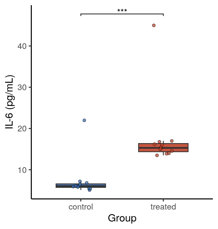
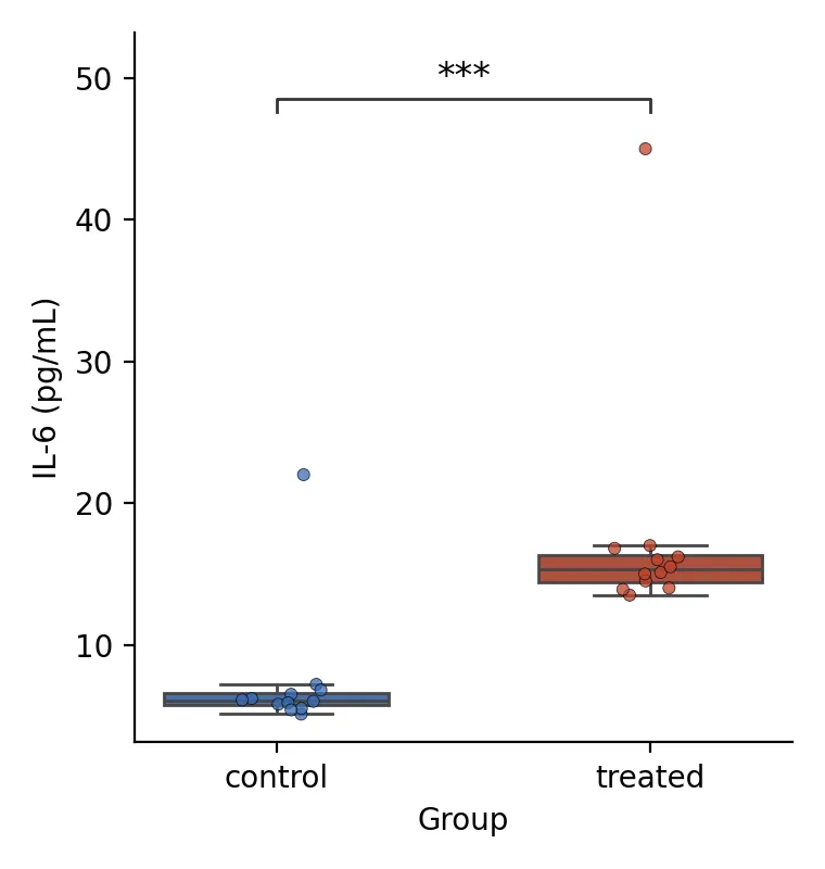
tumor_volume.csvcompares tumor volume in a control and a treated arm. Both groups are roughly normal, so the check lands on a t-test.cytokine_pg_ml.csvcompares an IL-6 readout. The values are right-skewed with a high outlier in each group, so the check falls back to Mann-Whitney.
Choosing the test, then drawing it
Section titled “Choosing the test, then drawing it”A Shapiro-Wilk test on each group decides the branch. When both groups pass, a Levene test decides equal versus unequal variance, and the plot gets a Student’s or Welch t-test. When either group fails, the plot gets a Mann-Whitney U. The bracket label is the significance code, not a raw number, which is what most journals print.
library(ggplot2)library(ggpubr)   # stat_pvalue_manual draws the bracketlibrary(rstatix)  # t_test / wilcox_test + add_xy_position
pal <- c("#3B6DB3", "#C1432B")
#' MakePlot.#'#' @param csv Input value.#' @param yvar Input value.#' @param ylab Input value.#' @param out Input value.#' @return Computed result.MakePlot <- function(csv, yvar, ylab, out) {  df <- as.data.frame(readr::read_csv(csv, show_col_types = FALSE))  df[["group"]] <- factor(df[["group"]])  f <- as.formula(paste(yvar, "~ group"))
  # The assumption check picks the test.  shapiro_p <- tapply(df[[yvar]], df[["group"]], \(v) shapiro.test(v)$p.value)  if (all(shapiro_p > 0.05)) {    equal_var <- rstatix::levene_test(df, f)$p > 0.05    stat <- rstatix::t_test(df, f, var.equal = equal_var)  } else {    stat <- rstatix::wilcox_test(df, f)  }  stat <- add_xy_position(add_significance(stat), x = "group")
  p <- ggplot(df, aes(.data[["group"]], .data[[yvar]])) +    geom_boxplot(aes(fill = .data[["group"]]), width = 0.6, outlier.shape = NA,      alpha = 0.9) +    geom_jitter(aes(fill = .data[["group"]]), width = 0.12, size = 1.6,                alpha = 0.75, shape = 21, stroke = 0.3) +    scale_fill_manual(values = pal) +    stat_pvalue_manual(stat, label = "p.signif", tip.length = 0.01) +    labs(x = "Group", y = ylab) +    theme_classic(base_size = 13) +    theme(legend.position = "none")
  ggsave(out, p, width = 3.8, height = 4.0, dpi = 200)}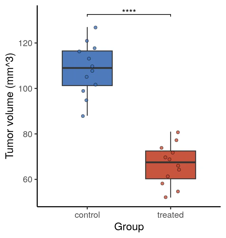
import matplotlib.pyplot as pltimport pandas as pd, seaborn as sns, pingouin as pgfrom scipy import statsfrom statannotations.Annotator import Annotator
PAL = ["#3B6DB3", "#C1432B"]

def stars(p):    """Return the significance label for a p value.
    Args:        p: P value to classify.
    Returns:        Significance label from ns to four stars.    """    for cut, mark in ((1e-4, "****"), (1e-3, "***"), (1e-2, "**"), (0.05, "*")):        if p < cut:            return mark    return "ns"

def make_plot(csv, yvar, ylab, out):    """Draw and save a two group comparison figure.
    Args:        csv: Input CSV path.        yvar: Name of the response column.        ylab: Label for the response axis.        out: Output image path.    """    df = pd.read_csv(csv)    order = sorted(df["group"].astype(str).unique())    a = df.loc[df["group"] == order[0], yvar]    b = df.loc[df["group"] == order[1], yvar]
    # The assumption check picks the test.    if stats.shapiro(a).pvalue > 0.05 and stats.shapiro(b).pvalue > 0.05:        equal_var = stats.levene(a, b, center="mean").pvalue > 0.05        p = float(pg.ttest(a, b, correction=not equal_var)["p_val"].iloc[0])    else:        p = float(pg.mwu(a, b)["p_val"].iloc[0])
    fig, ax = plt.subplots(figsize=(3.8, 4.0))    sns.boxplot(        data=df,        x="group",        y=yvar,        hue="group",        order=order,        palette=PAL,        legend=False,        width=0.6,        fliersize=0,        ax=ax,    )    sns.stripplot(        data=df,        x="group",        y=yvar,        hue="group",        order=order,        palette=PAL,        legend=False,        size=4,        alpha=0.75,        edgecolor="black",        linewidth=0.3,        jitter=0.12,        ax=ax,    )    annot = Annotator(ax, [(order[0], order[1])],                      data=df,                      x="group",                      y=yvar,                      order=order)    annot.configure(line_width=1.0, fontsize=12)    annot.set_custom_annotations([stars(p)])    annot.annotate()    ax.set(xlabel="Group", ylabel=ylab)    for s in ("top", "right"):        ax.spines[s].set_visible(False)    fig.tight_layout()    fig.savefig(out, dpi=200)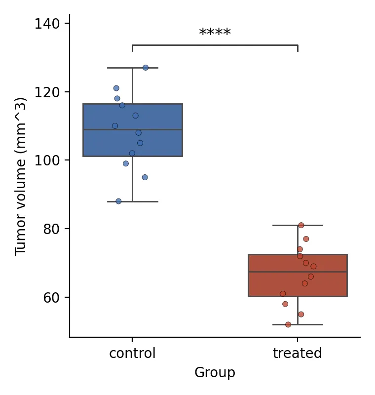
What the two engines agree on
Section titled “What the two engines agree on”On the tumor-volume data both languages land on Student’s t-test and return the same p-value to the digit, p = 1.08e-9, a four-star bracket. That is the parity you expect when two implementations run the same test on the same numbers.
The cytokine data is more honest about where R and Python differ. Both pick
Mann-Whitney, and both draw a three-star bracket, but the p-values are not identical:
rstatix::wilcox_test uses the exact null distribution, while pingouin.mwu uses the
normal approximation with a continuity correction. The conclusion is the same, the
fourth decimal is not. When you report the number, say which one you computed.
Making it publication-ready
Section titled “Making it publication-ready”A few choices separate a default plot from a figure a journal will print.
- Draw the points.
outlier.shape = NAon the box, then a jitter layer, so no point is drawn twice and the reader sees the real n. - Let the test choose itself. A hard-coded t-test on skewed data is the most common quiet error in a methods figure. The Shapiro branch above removes it.
- Label with the significance code, not
p = 0.0313. Reviewers scan stars. - Keep it small. At 3.8 by 4.0 inches the figure drops into a multi-panel layout without rescaling, and the type stays readable at column width.
The runnable scripts, the exact fixtures, and the container are in the companion code
repo under guides/figures/two-group-comparison/.