Hypothesis Testing
Hypothesis testing asks one question. Given two groups of measurements, is the difference between them larger than we would expect from chance alone? This page compares gene expression between a control group and a treated group. The same analysis is shown in R and Python. Pick a language with the tabs and the whole page follows your choice.
Every code block on this page runs in a container in the companion repository. The numbers and figures below come from those real runs, not from memory.
The data
Section titled “The data”We use a small dataset of log2 expression values. Twelve control samples and
twelve treated samples live in expression.csv with three columns: sample,
group, and expression.
df <- read.csv("expression.csv")import pandas as pd
df = pd.read_csv("expression.csv")Comparing two groups with a t-test
Section titled “Comparing two groups with a t-test”The two-sample t-test asks whether two group means differ. We use the Welch variant, which does not assume the groups share the same variance. It is the safer default for real data.
t.test(expression ~ group, data = df) Welch Two Sample t-test
data: expression by groupt = -13.396, df = 20.672, p-value = 1.176e-11alternative hypothesis: true difference in means between group control and group treated is not equal to 095 percent confidence interval: -1.511643 -1.105024sample estimates:mean in group control mean in group treated 5.050000 6.358333from scipy import stats
control = df.loc[df["group"] == "control", "expression"]treated = df.loc[df["group"] == "treated", "expression"]
t_res = stats.ttest_ind(control, treated, equal_var=False)print(f"Welch t-test: t = {t_res.statistic:.3f}, p = {t_res.pvalue:.3e}")Welch t-test: t = -13.396, p = 1.176e-11Both languages report the same statistic. The t value is -13.396 and the p-value is about 1.2e-11. The mean difference is roughly 1.3 log2 units, and the p-value is far below 0.05, so the difference between the groups is clear.
Visualizing the comparison
Section titled “Visualizing the comparison”A boxplot shows the two distributions and the individual points behind the test, with
a significance bracket on top carrying the test p-value. In R, ggpubr handles both:
ggboxplot() builds the plot and stat_compare_means() runs the test and draws the
bracket. In Python we use seaborn for the boxplot, and since statannotations does
not play nicely with current seaborn, we draw the bracket directly and label it with
the real p-value.
# ggboxplot builds the plot. stat_compare_means adds the bracket.library(ggpubr)
# ggpubr attaches ggplot2, so a separate library(ggplot2) is not needed.# ggboxplot()# is ggpubr's boxplot wrapper; stat_compare_means() runs the test and draws# the bracket.ggboxplot(df, x = "group", y = "expression", fill = "group",          palette = c("#e07a5f", "#69b3a2"), add = "jitter") +  stat_compare_means(comparisons = list(c("control", "treated")),                     method = "t.test", label = "p.format")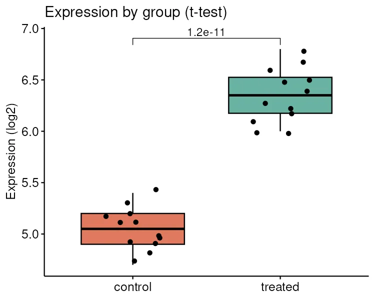
import matplotlib.pyplot as pltimport seaborn as sns
fig, ax = plt.subplots(figsize=(5, 4))sns.boxplot(    data=df,    x="group",    y="expression",    hue="group",    legend=False,    width=0.5,    fliersize=0,    ax=ax,)sns.stripplot(data=df,              x="group",              y="expression",              color="black",              alpha=0.6,              ax=ax)
# Significance bracket with the real Welch t-test p-value.y = df["expression"].max() + 0.25ax.plot([0, 0, 1, 1], [y, y + 0.1, y + 0.1, y], lw=1.2, color="black")ax.text(0.5, y + 0.12, f"p = {t_res.pvalue:.2g}", ha="center", va="bottom")ax.set_ylim(top=y + 0.6)
ax.set_xlabel("")ax.set_ylabel("Expression (log2)")ax.set_title("Expression by group")fig.tight_layout()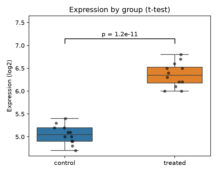
A non-parametric alternative
Section titled “A non-parametric alternative”The t-test assumes the values are roughly normal. When that assumption is shaky, or the sample is small, a rank-based test is safer. It compares the ranks of the values instead of their means. R calls it the Wilcoxon rank-sum test. Python calls the same test the Mann-Whitney U test.
wilcox.test(expression ~ group, data = df) Wilcoxon rank sum test with continuity correction
data: expression by groupW = 0, p-value = 3.56e-05alternative hypothesis: true location shift is not equal to 0u_res = stats.mannwhitneyu(control, treated, alternative="two-sided")print(f"Mann-Whitney U: U = {u_res.statistic:.1f}, p = {u_res.pvalue:.3e}")Mann-Whitney U: U = 0.0, p = 3.560e-05The same boxplot, annotated now with the rank-based p-value. Switching the test is a
one-word change: method = "wilcox.test".
ggboxplot(df, x = "group", y = "expression", fill = "group", palette = c("#e07a5f", "#69b3a2"), add = "jitter") + stat_compare_means(comparisons = list(c("control", "treated")), method = "wilcox.test", label = "p.format")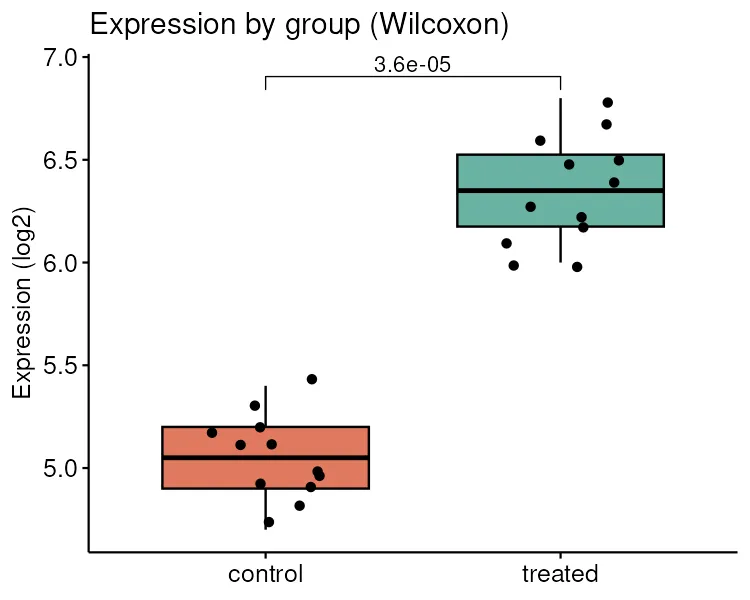
# reuse the same bracket helper, passing the Mann-Whitney p-valueboxplot_with_bracket(u_res.pvalue, "Expression by group (Wilcoxon)", "wilcox-boxplot-python.png")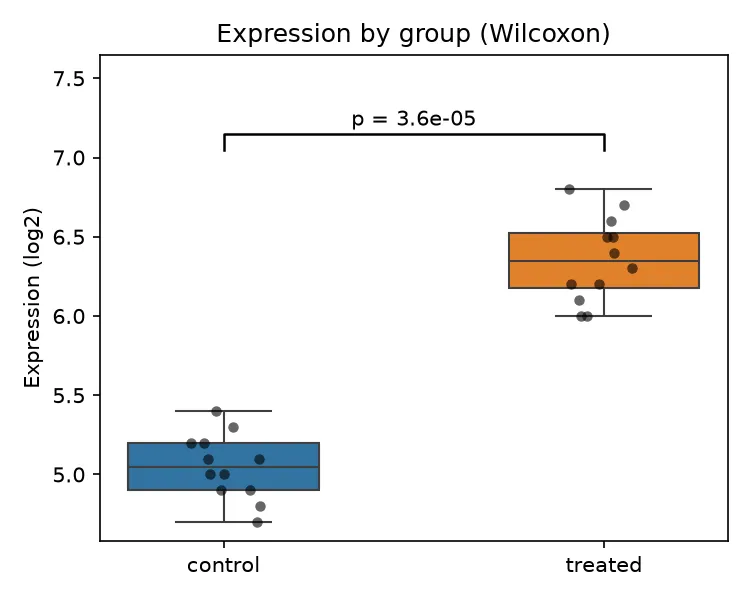
The rank-based test agrees with the t-test. The p-value is about 3.6e-05, still far below 0.05. When both a parametric and a non-parametric test point the same way, you can report the result with confidence.
Key points
Section titled “Key points”- The Welch t-test compares two group means without assuming equal variances.
- A boxplot with the raw points shown is the honest way to visualize the comparison.
- The Wilcoxon or Mann-Whitney test is the rank-based fallback when normality is in doubt.
- R and Python give the same answer. The choice between them is a matter of habit, not of correctness.