Principal Component Analysis
A modern experiment measures thousands of genes across dozens of samples. You cannot plot that directly. Principal component analysis compresses the variables into a few new axes that capture most of the variation, so you can see the structure: which samples group together, and whether a batch effect is hiding in the data. This page runs PCA on an expression matrix, in R and Python.
Every code block on this page runs in a container in the companion repository. The numbers and figures come from those real runs.
When to use PCA
Section titled “When to use PCA”Use it to explore and to check quality. Before differential expression or clustering, PCA shows whether samples separate by biology or by batch. It is unsupervised, so it finds the largest sources of variation whether or not they are the ones you care about.
The data
Section titled “The data”expression_matrix.csv has 60 samples and 50 genes, in two groups. The groups differ
in the first ten genes.
Running PCA
Section titled “Running PCA”Genes are on different scales, so standardize them first, then decompose. The variance explained tells you how much each component captures.
mat <- as.matrix(df[, grep("^gene_", names(df))])pca <- prcomp(mat, center = TRUE, scale. = TRUE)summary(pca)$importance[2, 1:5] PC1 PC2 PC3 PC4 PC50.149 0.060 0.059 0.053 0.049from sklearn.decomposition import PCAfrom sklearn.preprocessing import StandardScaler
features = StandardScaler().fit_transform(df[genes])pca = PCA().fit(features)pca.explained_variance_ratio_[:5][0.149 0.06 0.059 0.053 0.049]Both agree. PC1 captures 15% of the variance, well above the rest, which sit near 5%. That gap is the signal: one dominant axis of variation, the group difference.
The scree plot
Section titled “The scree plot”The scree plot shows the variance explained per component. Look for the elbow, where the bars level off. Components after the elbow are mostly noise.
ggplot(scree, aes(PC, var)) + geom_col()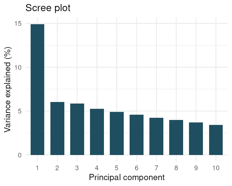
plt.bar(range(1, 11), 100 * pca.explained_variance_ratio_[:10])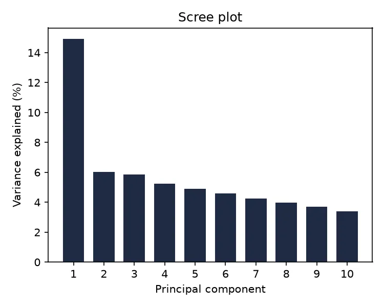
The sample scatter
Section titled “The sample scatter”Plotting the samples on PC1 and PC2, colored by group, is the payoff. The two groups separate cleanly along PC1.
scores <- data.frame(PC1 = pca$x[, 1], PC2 = pca$x[, 2], group = df$group)ggplot(scores, aes(PC1, PC2, color = group)) + geom_point()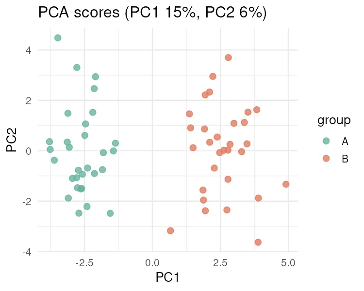
scores = pca.transform(features)plt.scatter(scores[:, 0], scores[:, 1], c=colors)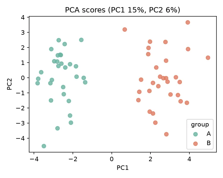
If that separation lined up with a sequencing batch instead of biology, you would have caught a batch effect before it wrecked the downstream analysis. That is what PCA is for.
Pitfalls and bioinformatics notes
Section titled “Pitfalls and bioinformatics notes”- Scale before you decompose. Without standardizing, a few high-variance genes dominate the components. Almost always center and scale.
- PCA is unsupervised. It finds the biggest variation, which may be a batch, a sex effect, or an outlier, not your treatment. Colour the scatter by every known covariate to see what PC1 really is.
- Do not over-read small components. A PC that explains 2% of the variance is usually noise. Focus on the ones before the scree elbow.
- The sign of a component is arbitrary. R and Python may flip a PC left to right. The separation is what matters, not which side a group lands on.
Key points
Section titled “Key points”- PCA compresses many correlated variables into a few components that capture most of the variance.
- The scree plot and the variance explained tell you how many components matter.
- The sample scatter reveals grouping and batch effects before downstream analysis.
- Standardize first, and remember PCA is unsupervised and sign-arbitrary.
Further reading
Section titled “Further reading”- STHDA, principal component analysis.
- An Introduction to Statistical Learning, chapter 12.
- The previous guide, Multiple testing correction, for the tests PCA often precedes.