ROC Curves & AUC
A logistic model, or any biomarker, produces a score. How well does that score separate patients who have the disease from those who do not? The ROC curve and its area, the AUC, answer that across every possible threshold at once. This page scores a biomarker against disease status, in R and Python.
Every code block on this page runs in a container in the companion repository. The numbers and figure come from those real runs.
When to use ROC and AUC
Section titled “When to use ROC and AUC”Use them to judge a continuous score or a classifier on a binary outcome. The AUC summarizes accuracy in one number that does not depend on a threshold, which makes it the standard way to compare biomarkers or models.
The data
Section titled “The data”roc_data.csv has 150 samples with a continuous score and a binary disease
label.
df <- read.csv("roc_data.csv")import pandas as pd
df = pd.read_csv("roc_data.csv")The AUC
Section titled “The AUC”The AUC is the probability that the score ranks a random diseased sample above a random healthy one. It runs from 0.5, no better than a coin, to 1.0, perfect.
library(pROC)
roc_obj <- roc(df$disease, df$score)auc(roc_obj)ci.auc(roc_obj)
AUC: 0.83295% CI: 0.766-0.8976 (DeLong)from sklearn.metrics import roc_auc_score
roc_auc_score(df["disease"], df["score"])AUC: 0.832Both give an AUC of 0.832. The score ranks a diseased sample above a healthy one
about 83% of the time. R’s pROC adds a DeLong confidence interval, 0.77 to 0.90,
which is a good habit: report the AUC with its uncertainty.
The ROC curve
Section titled “The ROC curve”The curve plots the true positive rate against the false positive rate as the threshold slides from strict to lenient. A curve that hugs the top-left corner is a good classifier. The diagonal is chance.
roc_df <- data.frame(fpr = 1 - roc_obj$specificities, tpr = roc_obj$sensitivities)ggplot(roc_df, aes(fpr, tpr)) + geom_line() + geom_abline(linetype = "dashed")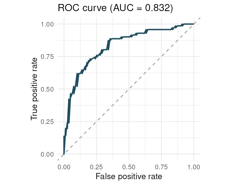
from sklearn.metrics import roc_curve
fpr, tpr, thresholds = roc_curve(df["disease"], df["score"])plt.plot(fpr, tpr)plt.plot([0, 1], [0, 1], ls="--")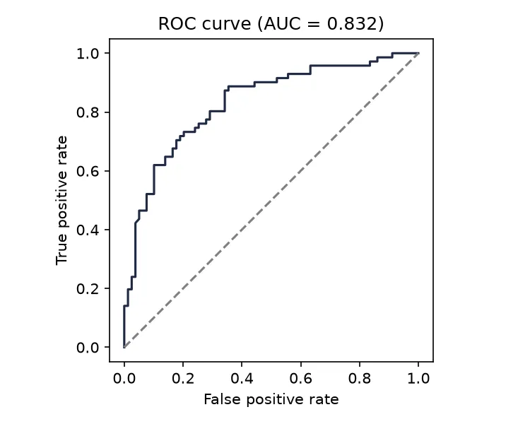
Choosing a threshold
Section titled “Choosing a threshold”The AUC judges the score across all thresholds. To actually classify, you pick one, and that is a trade-off. A strict threshold catches fewer true cases but raises fewer false alarms. Youden’s index, the point that maximizes sensitivity plus specificity minus one, is a common default, but the right choice depends on the cost of a miss versus a false alarm.
Pitfalls and bioinformatics notes
Section titled “Pitfalls and bioinformatics notes”- AUC hides the threshold. A great AUC does not tell you where to cut. Choose the threshold from the clinical costs, then report sensitivity and specificity there.
- Imbalanced classes mislead AUC. With very rare disease, a high ROC AUC can still mean many false positives. The precision-recall curve is more honest there.
- Validate on held-out data. An AUC computed on the same data used to fit the model is optimistic. Report it on a test set.
- AUC is not everything. Two models with the same AUC can behave very differently at the threshold you care about.
Key points
Section titled “Key points”- The AUC is the chance the score ranks a case above a control, from 0.5 to 1.0.
- The ROC curve shows the sensitivity and specificity trade-off across thresholds.
- Report the AUC with a confidence interval, and pick the threshold from clinical costs.
- On rare outcomes, prefer the precision-recall curve.
Further reading
Section titled “Further reading”- pROC documentation, and scikit-learn’s ROC and AUC guide.
- An Introduction to Statistical Learning, chapter 4, on classification.
- The previous guide, Logistic regression, for the model that often produces the score.