Descriptive Statistics & Distributions
Before any test, look at your data. Descriptive statistics summarize a variable in a few numbers. A distribution plot shows its shape. Together they tell you what kind of analysis is even appropriate. This page summarizes gene expression values and read counts, in R and Python. Pick a language with the tabs and the whole page follows.
Every code block on this page runs in a container in the companion repository. The numbers and figures come from those real runs.
When to look at descriptive statistics
Section titled “When to look at descriptive statistics”Always, and first. Before a t-test, before a model, before a figure for a paper, you summarize each variable and plot its distribution. This is where you catch the problems that break later analysis: skew, outliers, a variable that is counts rather than a continuous measurement, or a batch that does not look like the others. A p-value computed on data you never looked at is a p-value you cannot trust.
The data
Section titled “The data”We use gene_expression.csv. It has 80 samples, a continuous expression value on
the log2 scale, and a discrete counts column of read counts.
df <- read.csv("gene_expression.csv")import pandas as pd
df = pd.read_csv("gene_expression.csv")The first rows look like this:
| sample | expression | counts |
|---|---|---|
| S01 | 6.37 | 46 |
| S02 | 4.75 | 44 |
| S03 | 6.90 | 33 |
| S04 | 7.13 | 32 |
| S05 | 3.66 | 39 |
Numeric summaries
Section titled “Numeric summaries”Two numbers describe the center of a variable. The mean is the average. The median is the middle value. Two numbers describe its spread. The standard deviation measures spread around the mean. The interquartile range, or IQR, is the width of the middle half of the data.
summary(df$expression)mean(df$expression)median(df$expression)sd(df$expression)IQR(df$expression) Min. 1st Qu. Median Mean 3rd Qu. Max. 3.660 5.447 6.145 6.031 6.753 8.570mean: 6.031median: 6.145sd: 0.929IQR: 1.305df["expression"].describe()count 80.000000mean 6.031000std 0.928916min 3.66000025% 5.44750050% 6.14500075% 6.752500max 8.570000Both languages agree. The mean is 6.03 and the median is 6.14. They are close, which is a first hint that the distribution is roughly symmetric. The standard deviation is 0.93, and the middle half of the values spans 1.31 log2 units.
Mean or median?
Section titled “Mean or median?”When the mean and median are close, either summarizes the center well. When they drift apart, the distribution is skewed, and the median is the more honest summary. Income is the classic example. A few very large values pull the mean up while the median stays put. In bioinformatics the same happens with raw expression and with library sizes. This is one reason expression is usually analyzed on the log scale, where the distribution is more symmetric.
Visualizing the distribution
Section titled “Visualizing the distribution”A histogram bins the values and counts how many fall in each bin. A density curve is a smoothed version of the same shape. Together they show the center, the spread, and whether the distribution is symmetric or has a tail.
library(ggplot2)
ggplot(df, aes(x = expression)) +  geom_histogram(aes(y = after_stat(density)), bins = 15,                 fill = "#69b3a2", color = "white") +  geom_density(color = "#1f4e5f", linewidth = 1) +  labs(x = "Expression (log2)", y = "Density")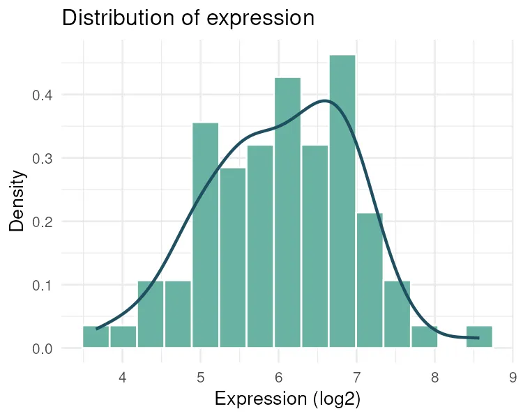
import seaborn as sns
ax = sns.histplot(df["expression"], bins=15, stat="density", color="#4c72b0")sns.kdeplot(df["expression"], color="#1f2a44", ax=ax)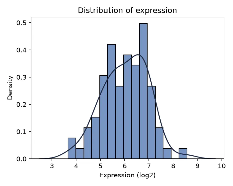
The expression values form a single rounded peak near 6, roughly symmetric, with no second mode and no extreme outliers. This is the shape a t-test or a linear model expects.
Checking for normality
Section titled “Checking for normality”Many tests assume a variable is roughly normal. The clearest visual check is the normal quantile-quantile, or Q-Q, plot. It plots the sorted data against the values a normal distribution would produce. If the points fall on the diagonal line, the data is close to normal. Systematic curves away from the line signal skew or heavy tails.
ggplot(df, aes(sample = expression)) + stat_qq() + stat_qq_line()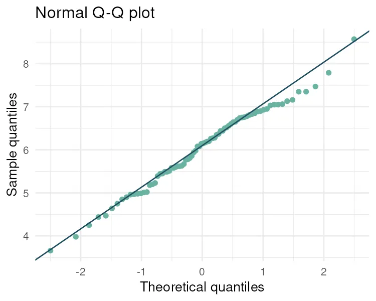
from scipy import stats
stats.probplot(df["expression"], dist="norm", plot=plt)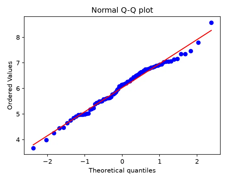
The points sit close to the line across the whole range, with only mild wandering at the ends. Expression is close enough to normal for the usual parametric tests. The next guide, Checking assumptions, turns this visual check into a formal test.
Count data behaves differently
Section titled “Count data behaves differently”Not every variable is continuous. Read counts are whole numbers, they cannot be negative, and their spread grows with their mean. They follow a Poisson or negative binomial distribution, not a normal one. Summarizing counts with a mean and standard deviation, or feeding them straight into a t-test, is a common mistake.
ggplot(df, aes(x = counts)) + geom_histogram(binwidth = 5, fill = "#e07a5f", color = "white") + labs(x = "Read counts", y = "Frequency")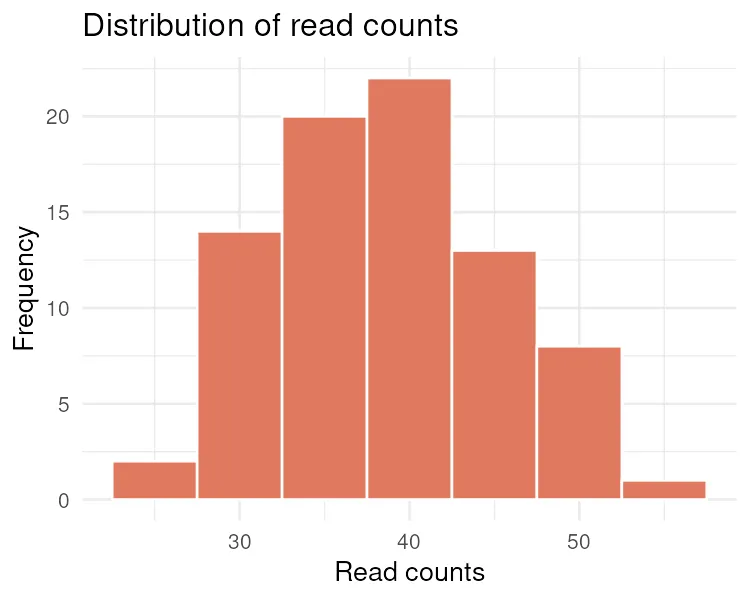
sns.histplot(df["counts"], binwidth=5, color="#dd8452")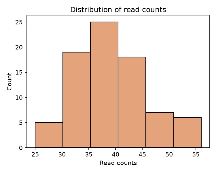
The counts are discrete and lean to one side. Tools like DESeq2 and edgeR model counts with a negative binomial distribution for exactly this reason. When you meet count data, reach for a count model, not a t-test.
Pitfalls and bioinformatics notes
Section titled “Pitfalls and bioinformatics notes”- Report spread, not just center. A mean with no standard deviation or IQR hides how variable the data is.
- A skewed variable needs the median. When the mean and median disagree, trust the median and consider a log transform.
- Counts are not continuous. Read counts, UMI counts, and peak counts follow count distributions. Summarize and model them as counts.
- Always plot before you test. A histogram takes seconds and catches problems that summary numbers hide, such as two hidden subpopulations in one variable.
Key points
Section titled “Key points”- The mean and median describe the center. The standard deviation and IQR describe the spread.
- When the mean and median are close, the distribution is roughly symmetric. When they diverge, it is skewed.
- A histogram with a density curve shows the shape. A Q-Q plot checks for normality.
- Count data follows a Poisson or negative binomial distribution and needs count-aware methods.
Further reading
Section titled “Further reading”- STHDA, descriptive statistics and distribution plots.
- An Introduction to Statistical Learning, chapter 2, for the wider picture on summarizing data.
- The next guide, Checking assumptions, makes the normality check formal.