FactoMineR PCA Figures
The PCA guide in the statistics section teaches the method
with prcomp and scikit-learn. This page is about the figures. FactoMineR computes
the decomposition and stashes everything a plot could want, cos2, contributions,
coordinates, on the result object. factoextra reads that object and returns
ggplot2 objects, which means every figure below takes ordinary ggplot layers,
themes and labels on top.
That combination is why these plots look finished with almost no styling code. Four
figures, one dataset, one PCA() call.
The data
Section titled “The data”expression_matrix.csv and expression_annotation.csv, the same pair the
clustered heatmap draws: 30 genes by 20 samples, ten
control and ten treated. Genes 1 to 20 are differentially expressed by construction
and genes 21 to 30 are noise, so the figures have a right answer to be checked
against rather than merely admired.
FactoMineR wants observations in rows, so the matrix is transposed first: samples become the individuals, genes become the variables.
library(FactoMineR)library(factoextra)library(ggplot2)
mat <- read.csv("../fixtures/expression_matrix.csv", row.names = 1,  check.names = FALSE)ann <- read.csv("../fixtures/expression_annotation.csv",  stringsAsFactors = FALSE)
expr <- as.data.frame(t(as.matrix(mat)))ann <- ann[match(rownames(expr), ann$sample), ]group <- factor(ann$group, levels = c("control", "treated"))
# scale.unit standardises every gene, so one high-variance gene cannot dominate.# graph = FALSE because factoextra draws the figures; FactoMineR's own# base-graphics plots are not what this page is about.res <- PCA(expr, scale.unit = TRUE, ncp = 5, graph = FALSE)
Everything below reads res. No further computation.
fviz_eig with addlabels = TRUE prints the percentage on each bar. That single
argument is the difference between a figure a reader can quote and one they have to
squint at.
fviz_eig(res, addlabels = TRUE, ncp = 8, barfill = "#3B6DB3", barcolor = "#3B6DB3") + labs(title = "Scree: variance carried by each component", x = "Principal component", y = "Percentage of variance") + theme_minimal(base_size = 12)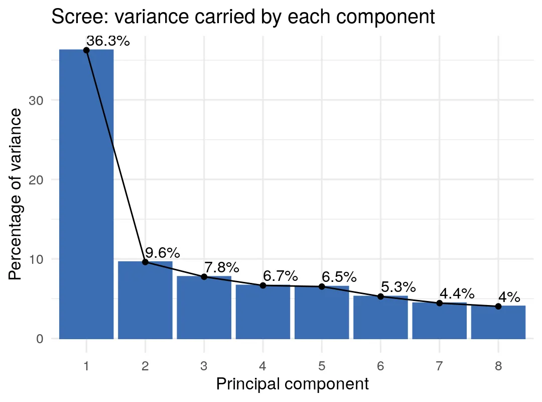
PC1 takes 36.3% and PC2 takes 9.6%. The elbow after the first bar is the shape you want to see when one factor dominates, and here that factor is the treatment.
Correlation circle
Section titled “Correlation circle”fviz_pca_var draws each variable as an arrow. Direction is how the gene loads on
the two components; length is cos2, the share of that gene’s variance captured in
this plane. A short arrow is not an unimportant gene, it is a gene this particular
plane does not describe.
fviz_pca_var(res, col.var = "cos2", repel = TRUE, gradient.cols = c("#D9E2EC", "#3B6DB3", "#C1432B"), select.var = list(cos2 = 12)) + labs( title = "Correlation circle, 12 best-represented genes", subtitle = paste( "Arrow length is cos2: how much of a gene sits in this plane" ) ) + theme_minimal(base_size = 12)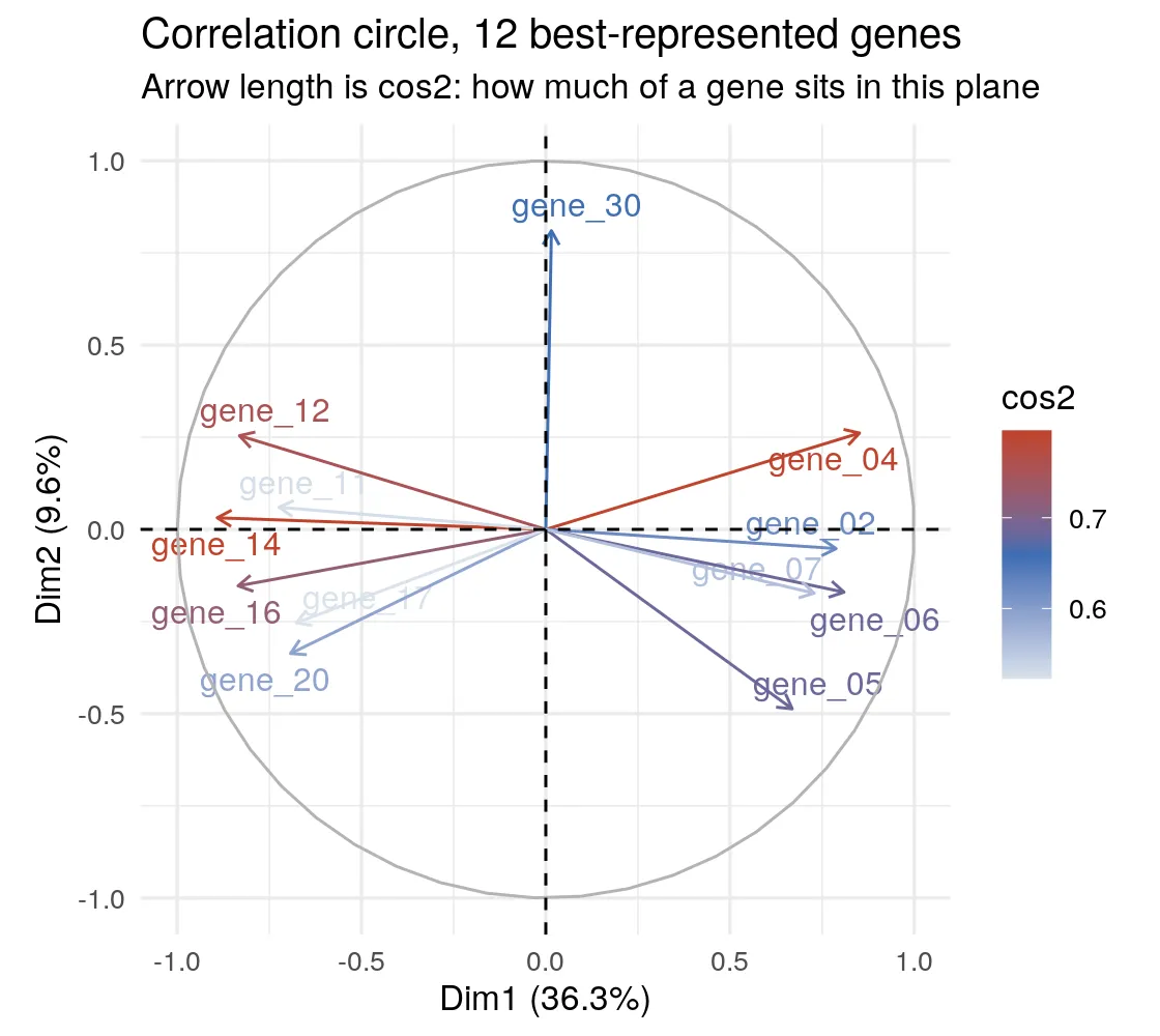
repel = TRUE is doing real work. Thirty overlapping labels is the usual reason a
correlation circle is unreadable, and select.var trimming to the twelve
best-represented genes is the other half of the fix.
Read the split: genes pointing right and genes pointing left are the two directions
of the treatment response. gene_30 pointing almost straight up is a noise gene that
happens to define PC2 by itself, which is exactly what a noise gene does once the
real signal has been absorbed by PC1.
Biplot with group ellipses
Section titled “Biplot with group ellipses”The figure that usually ends up in the paper. Samples coloured by group, 95% confidence ellipses, and the variable arrows that explain the separation, all on one set of axes.
fviz_pca_biplot( res, habillage = group, addEllipses = TRUE, ellipse.level = 0.95, palette = c("#3B6DB3", "#C1432B"), col.var = "grey30", alpha.var = 0.55, repel = TRUE, select.var = list(contrib = 8), label = "var", pointsize = 2.4) + labs(title = "Biplot: samples, group ellipses, and the genes driving them", subtitle = "Arrows are the 8 genes contributing most to this plane") + theme_minimal(base_size = 12)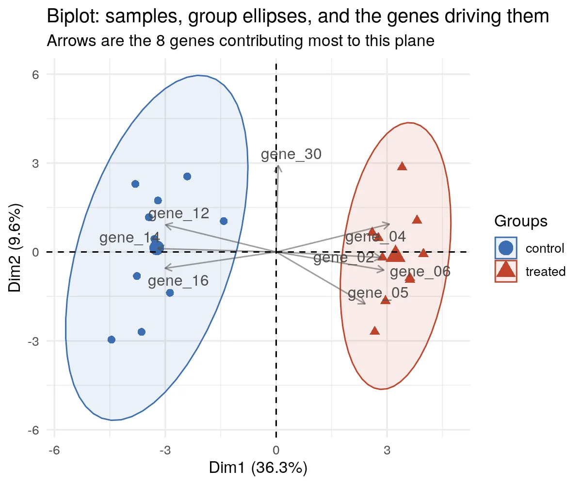
habillage is the argument to remember. Hand it a factor and it colours the points,
sets the legend and drives the ellipses in one go. Fitting an ellipse per group by
hand in ggplot2 is a dozen lines; here it is two arguments.
The two ellipses do not touch. Along PC1 the separation is worth t = -20.7, p = 2.4e-12, so the picture and the test agree.
Contributions
Section titled “Contributions”Which genes actually build the component. The dashed red line is the contribution each gene would have if all thirty contributed equally, so anything above it is pulling more than its share.
fviz_contrib(res, choice = "var", axes = 1, top = 15, fill = "#3B6DB3", color = "#3B6DB3") + labs(title = "Contribution to PC1, top 15 genes", subtitle = "Dashed line is the equal-contribution baseline", x = "Gene", y = "Contribution (%)") + theme_minimal(base_size = 12) + theme(axis.text.x = element_text(angle = 45, hjust = 1))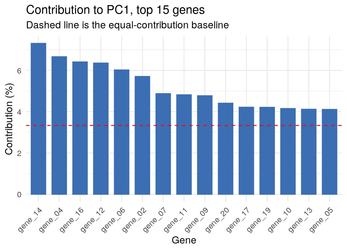
Note axes = 1 rather than axes = 1:2. Those are different questions, and mixing
them is how a figure quietly stops matching the sentence next to it. On PC1 alone the
differentially expressed block owns the ranking: the twenty DE genes hold 92.3% of
the total PC1 contribution, and all ten of the top ten contributors are DE genes.
Ask for PC1 and PC2 together and gene_30 climbs into the list, because it defines
PC2 on its own. Both figures are correct; only one of them is about the treatment.
Making it publication-ready
Section titled “Making it publication-ready”- Standardise unless you have a reason not to.
scale.unit = TRUEis the default inPCA()for good reason: on raw expression the highest-variance gene writes PC1. - Always print the variance percentages on the axis labels. factoextra does this for you, and a biplot without them cannot be interpreted.
- Trim the arrows.
select.var = list(contrib = 8)orlist(cos2 = 12)turns an unreadable hairball into a figure. Say in the caption which rule you used and how many you kept, because a reader cannot tell from the picture. - Treat the ellipses as description, not inference.
addEllipsesdraws a confidence region for the group mean on axes that were themselves chosen to maximise variance. Separation there is not a hypothesis test, which is why the number quoted above comes from a test on the PC1 scores rather than from the ellipses. - Check the components against something you already know. Here the DE block should dominate PC1, and it does. If it had not, the figure would have been telling you about a batch effect.
Further reading
Section titled “Further reading”- Lê, S., Josse, J., Husson, F. (2008). FactoMineR: An R Package for Multivariate Analysis. Journal of Statistical Software 25(1).
- The factoextra reference, which documents
every
fviz_*function and its arguments. - FactoMineR goes well past PCA: correspondence analysis, multiple correspondence
analysis, multiple factor analysis for multi-block data, and HCPC for clustering on
principal components. Every one of them has a matching
fviz_*.
The runnable script and the container are in the companion code repo under
guides/figures/factominer-pca/.