Clustered Heatmap
A heatmap earns its place when it makes a block structure obvious that a table of numbers would bury. Two things make that happen: scaling each row so no single high-expression gene washes out the color, and clustering both axes so similar samples and similar features sit together. Do both and the groups fall out of the figure on their own.
This page draws a clustered heatmap of a 30-feature by 20-sample expression matrix
with a control-versus-treated annotation bar. R uses ComplexHeatmap, Python uses
seaborn.clustermap. Both run in the pinned pubplot container.
The data
Section titled “The data”expression_matrix.csv is a feature-by-sample matrix: the first column is the gene
id, the rest are samples. expression_annotation.csv labels each sample control or
treated. In this fixture the first twenty genes are differentially expressed by
construction and the last ten are noise, so a good heatmap should split the samples
cleanly and leave the noise genes unstructured.
Scale the rows, cluster both axes
Section titled “Scale the rows, cluster both axes”Z-scoring runs across each row: subtract the gene’s mean, divide by its standard deviation. After that the color means the same thing in every row, relative expression in units of standard deviation, and the diverging blue-white-red map is centered at zero. Cluster the columns and the two groups separate without being told where the split is.
library(ComplexHeatmap)library(circlize)
mat  <- as.matrix(read.csv("expression_matrix.csv", row.names = 1))disp <- t(scale(t(mat)))            # z-score each rowdisp[!is.finite(disp)] <- 0
ann <- read.csv("expression_annotation.csv", row.names = 1)[colnames(mat), ,  drop = FALSE]top <- HeatmapAnnotation(df = ann,                         col = list(group = c(control = "#3B6DB3",                           treated = "#C1432B")))col_fun <- colorRamp2(c(-2, 0, 2), c("#3B6DB3", "white", "#C1432B"))
ht <- Heatmap(disp, name = "z-score", col = col_fun,              cluster_rows = TRUE, cluster_columns = TRUE, top_annotation = top)draw(ht, merge_legends = TRUE)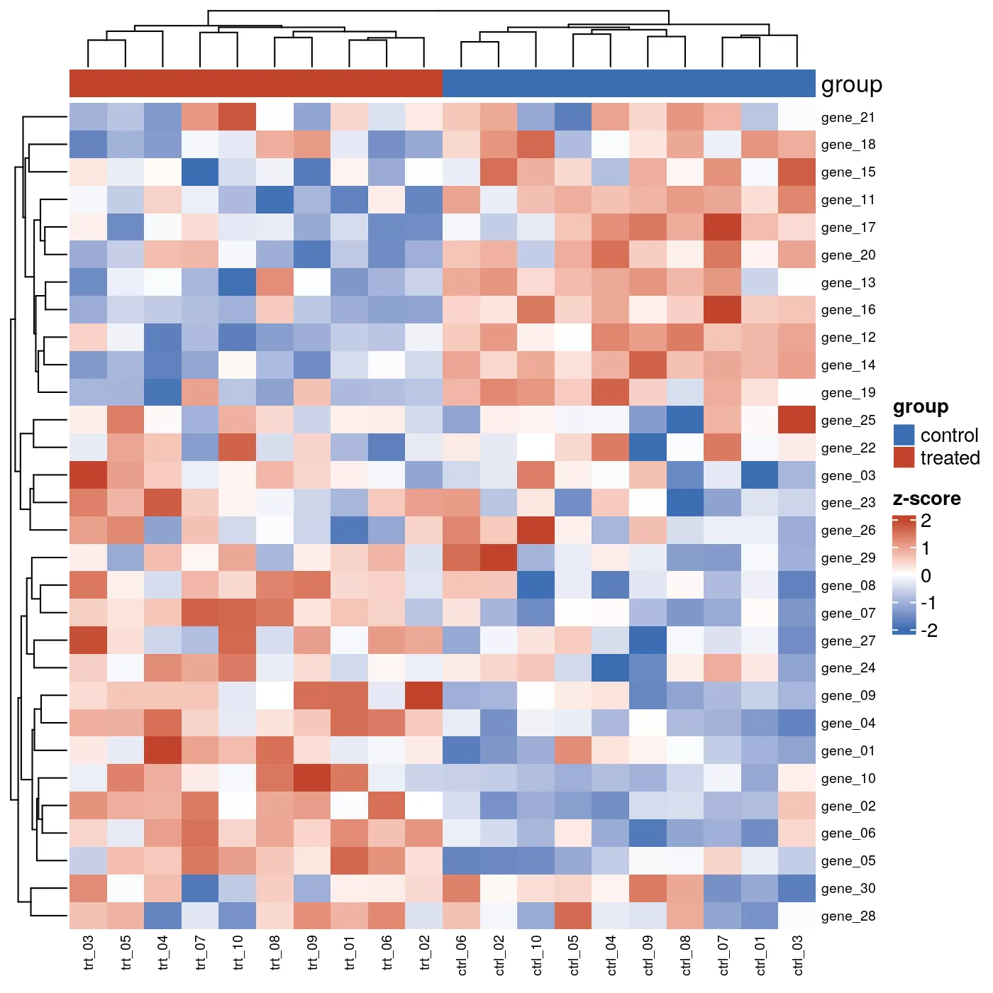
import pandas as pd, seaborn as snsfrom matplotlib.patches import Patch
mat = pd.read_csv("expression_matrix.csv", index_col=0)disp = mat.sub(mat.mean(axis=1), axis=0).div(mat.std(axis=1), axis=0).fillna(0)
ann = pd.read_csv("expression_annotation.csv", index_col=0).reindex(mat.columns)colors = {"control": "#3B6DB3", "treated": "#C1432B"}col_colors = ann["group"].map(colors)
g = sns.clustermap(    disp,    cmap="RdBu_r",    center=0,    vmin=-2,    vmax=2,    row_cluster=True,    col_cluster=True,    col_colors=col_colors,    cbar_kws={"label": "z-score"},    figsize=(7, 7),)
# clustermap draws the color bar but no legend for it; add one.g.ax_col_dendrogram.legend(    handles=[Patch(color=c, label=l) for l, c in colors.items()],    title="group",    ncol=2,    frameon=False,)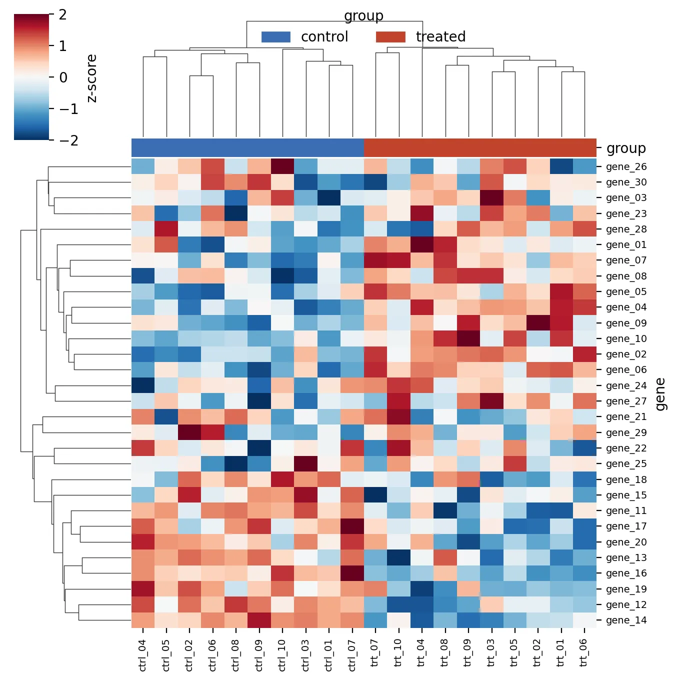
Both engines split the columns into a control block and a treated block, and both pull
the twenty structured genes into two clean bands while the ten noise genes scatter. The
dendrograms differ in orientation and in the exact linkage, because ComplexHeatmap
and scipy default to different clustering methods. The block structure is the same.
Making it publication-ready
Section titled “Making it publication-ready”- Z-score the rows before drawing. An unscaled heatmap shows which genes are highly expressed, which is almost never the question. The scaled version shows which samples move together.
- Center the color map at zero and make it diverging. Blue-white-red reads as down-nothing-up; a sequential map hides the sign.
- Clip the scale, here at plus and minus two standard deviations, so a single extreme cell does not flatten the rest of the map to pale.
- Annotate the columns with the sample group and give the bar a legend. A colored strip with no key is a decoration, not data.
The runnable scripts and both fixtures are in the companion code repo under
guides/figures/heatmap/.