Cox Forest Plot
A Kaplan-Meier log-rank tells you two arms differ. It cannot tell you the treatment effect once you account for the fact that one arm happened to be younger, or sicker at baseline. That is the Cox model’s job, and the forest plot is how you show it: one hazard ratio per covariate, each with a confidence interval, all on a log axis with the null hazard ratio at 1.
This page fits a Cox model on the same trial data as the Kaplan-Meier page, adjusting
the treatment effect for age, sex, and stage. R uses survminer::ggforest, Python
uses lifelines. Both run in the pinned pubplot container and return the same
hazard ratios.
The data
Section titled “The data”survival_trial.csv again: time, event, arm, plus the covariates age, sex,
and stage. The model is Surv(time, event) ~ arm + age + sex + stage.
Fit the model, plot the ratios
Section titled “Fit the model, plot the ratios”Read a forest plot by the confidence interval, not the point. A hazard ratio whose interval crosses 1 is compatible with no effect. Here the treated arm sits at 0.54 with an interval from 0.34 to 0.88, clear of 1, so the benefit survives adjustment.
library(survival)library(survminer)
for (col in c("arm", "sex", "stage")) df[[col]] <- factor(df[[col]])
cox <- coxph(Surv(time, event) ~ arm + age + sex + stage, data = df)ggforest(cox, data = df)   # rows, reference levels, HR + CI, and global stats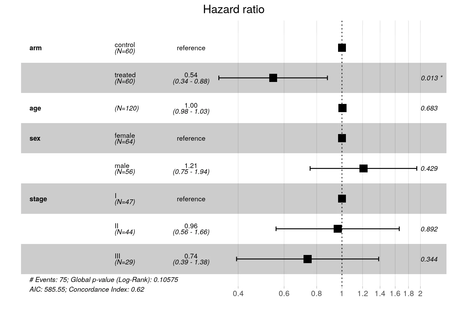
import matplotlib.pyplot as pltimport numpy as np, pandas as pdfrom lifelines import CoxPHFitter
# Dummy-code the categoricals (drop the first level as the reference).design = df[["time", "event"]].copy()for col in ["arm", "sex", "stage"]:    s = df[col]    if s.dtype == object:        for level in sorted(s.astype(str).unique())[1:]:            design[f"{col}[{level}]"] = (s.astype(str) == level).astype(int)    else:        design[col] = s
cph = CoxPHFitter().fit(design, "time", "event")s = cph.summaryterms, hr = list(s.index), s["exp(coef)"].to_numpy()lo, hi = (    s["exp(coef) lower 95%"].to_numpy(),    s["exp(coef) upper 95%"].to_numpy(),)
yy = np.arange(len(terms))[::-1]fig, ax = plt.subplots(figsize=(7.4, 4.0))ax.errorbar(hr,            yy,            xerr=[hr - lo, hi - hr],            fmt="s",            color="black",            capsize=3,            ms=6)ax.axvline(1.0, ls=":", color="grey")ax.set_xscale("log")ax.set_yticks(yy)ax.set_yticklabels(terms)ax.set_xlabel("Hazard ratio (95% CI)")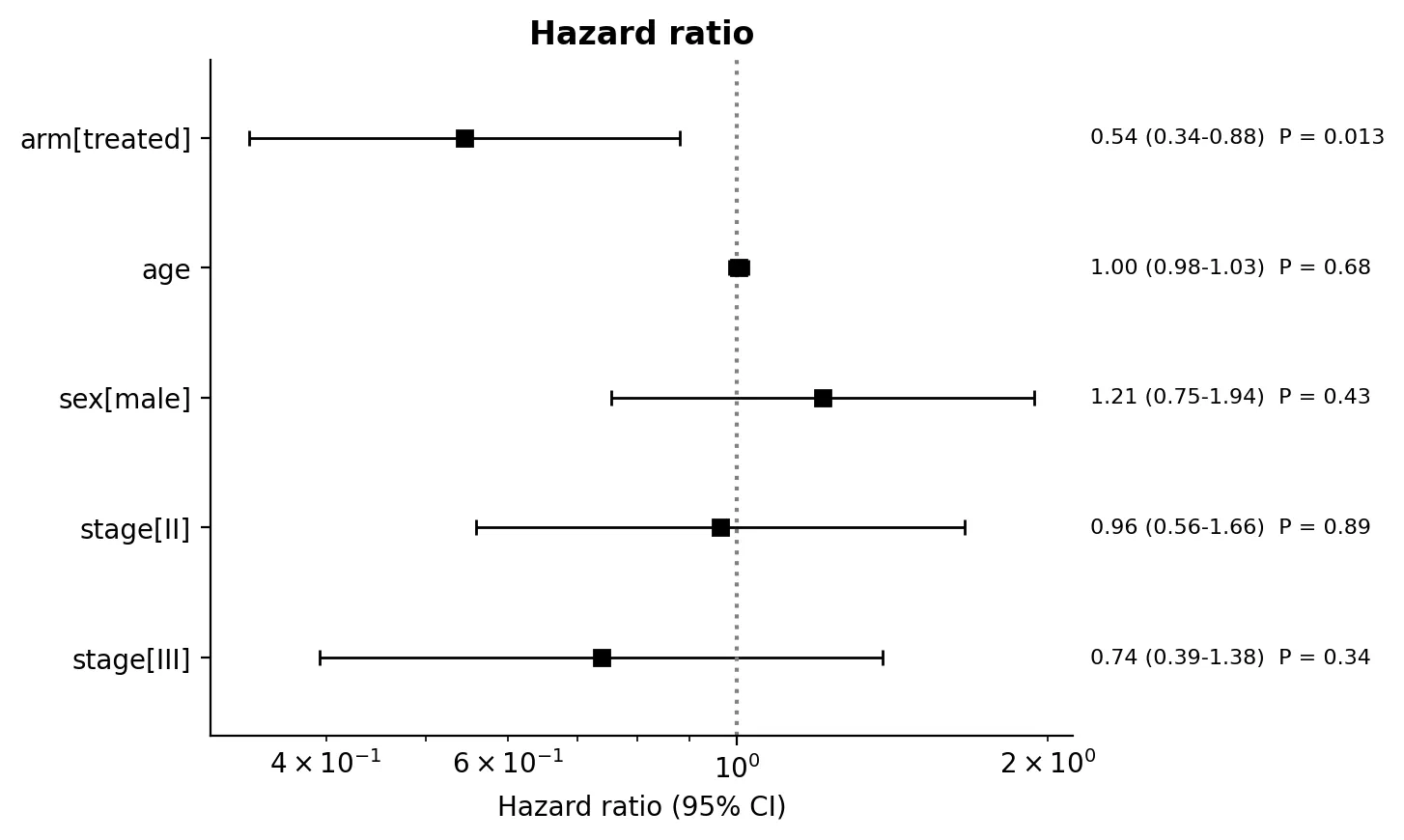
Both fits return the same ratios: treated 0.54 (0.34 to 0.88), age 1.00, male 1.21,
and the two higher stages near 1. The R panel is fuller. ggforest prints the
reference level for each factor, the group sizes, and the global model statistics
below the plot. The lifelines version shows the estimated terms only, which is
tighter but leaves the reader to infer the reference. When you build the Python forest
by hand, add the reference rows if the journal expects them.
Making it publication-ready
Section titled “Making it publication-ready”- Use a log x-axis. A hazard ratio of 0.5 and one of 2.0 are the same size effect in opposite directions; only a log scale places them symmetrically around 1.
- Draw the null line at 1 and let the reader judge each interval against it.
- Label with the hazard ratio and its interval, not the p-value alone. The interval shows both the effect and its precision.
- State the reference level for every categorical covariate. A hazard ratio is meaningless without the group it compares against.
The runnable scripts and fixture are in the companion code repo under
guides/figures/cox-forest/.