ggstatsplot, the Test on the Plot
Every page in this section argues the same thing: a comparison figure should
carry its statistical test, not leave it in the text. ggstatsplot takes that
argument to its conclusion. One function call draws the figure and prints the
test statistic, the p-value, the effect size with its confidence interval, and
a Bayes factor, all on the plot. Where the section’s other pages assemble that
from ggpubr, rstatix and a manual bracket, here a single call does it.
This page builds six figures on four small fixtures, all generated and
committed beside the code. A two-group readout for ggbetweenstats, and a
paired before-and-after readout for ggwithinstats, which is the one
comparison shape the section does not draw anywhere else. Then the shapes the
statistics section teaches without a figure: a one-sample test against a
reference, a correlation, a correlation matrix, and a proportion comparison.
All run in the pinned ggstats image.
What the subtitle is telling you
Section titled “What the subtitle is telling you”The plot carries two annotations. The subtitle is the frequentist result: the test, its statistic, the p-value, and the effect size with a 95 percent confidence interval. The caption at the bottom is the Bayesian result: the Bayes factor and the posterior estimate of the difference.
The Bayes factor is the one number on the plot the rest of the section does
not print. Where a p-value says how surprising the data would be under the
null, the Bayes factor compares the evidence for the alternative against the
null directly. The plot prints it as log[e](BF[01]), the log of the Bayes
factor for the null over the alternative. A negative value means the data
favour the alternative: the more negative, the stronger the evidence. It is a
different question from the p-value, and this page shows it once, briefly,
rather than teaching Bayesian inference.
Two groups: ggbetweenstats
Section titled “Two groups: ggbetweenstats”The fixture is a biomarker in a control and a treated arm, 28 samples each, built so the treated arm sits about one standard deviation higher. One call draws the violin, the box, the points, and the full statistical annotation.
library(ggstatsplot)
twogroup <- read.csv("fixtures/twogroup_biomarker.csv")twogroup$group <- factor(twogroup$group, levels = c("control", "treated"))
ggbetweenstats(  data         = twogroup,  x            = group,  y            = biomarker,  type         = "p",          # parametric: t-test, Cohen's d, Bayes factor  effsize.type = "d",  bf.message   = TRUE,         # print the Bayes factor in the caption  xlab         = "arm",  ylab         = "biomarker",  title        = "Two-group comparison with the test on the plot")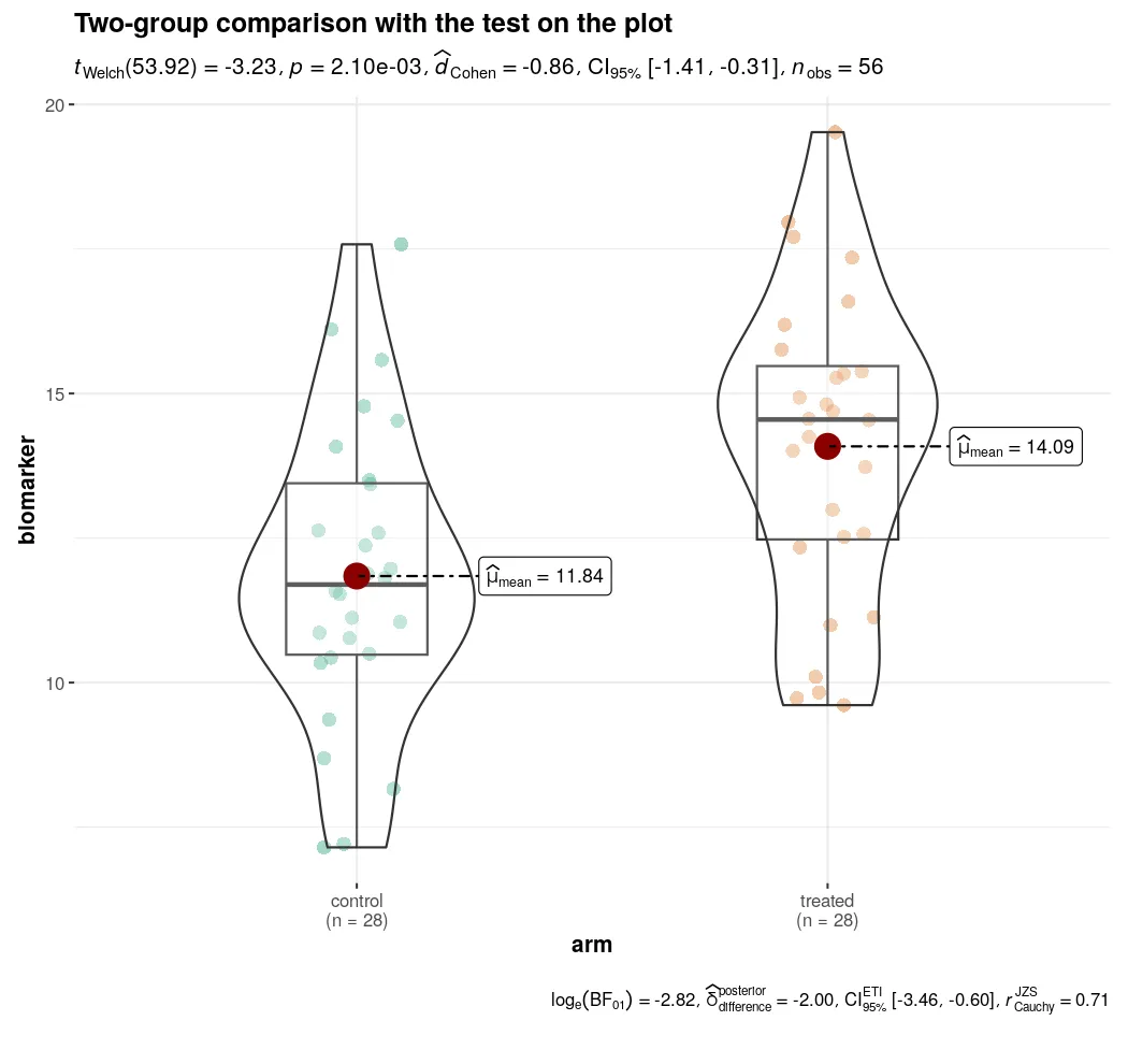
The subtitle reads t[Welch](53.92) = -3.23, p = 2.10e-03, d[Cohen] = -0.86, 95% CI [-1.41, -0.31], n[obs] = 56. The same test run by hand gives t = -3.2314, df = 54, p = 0.002101. The plot chose the Welch branch on its own;
the hand-run line above uses the pooled-variance branch, which is why the
degrees of freedom differ by a fraction. The effect size is the part to read:
a Cohen’s d near 0.86 is a large effect, and its interval [-1.41, -0.31]
clears zero, so the difference is not only significant but substantial.
The caption reads log[e](BF[01]) = -2.82, posterior delta = -2.00, 95% ETI [-3.46, -0.60]. The negative log Bayes factor says the data favour the
treated-over-control difference, and the posterior estimate of that difference
is about two units with an interval clear of zero. Frequentist and Bayesian
readings agree here, which they will not always do.
Paired data: ggwithinstats
Section titled “Paired data: ggwithinstats”The paired fixture follows 24 subjects before and after a treatment. Each subject’s baseline varies widely, but the drop is consistent, which is exactly the situation a paired test has power for and an unpaired one wastes. This is the comparison shape the rest of the section has no figure for.
paired <- read.csv("fixtures/paired_score.csv")paired$time    <- factor(paired$time, levels = c("before", "after"))paired$subject <- factor(paired$subject)
ggwithinstats(  data         = paired,  x            = time,  y            = score,  type         = "p",  effsize.type = "d",  bf.message   = TRUE,  xlab         = "time point",  ylab         = "score",  title        = "Paired comparison with the test on the plot")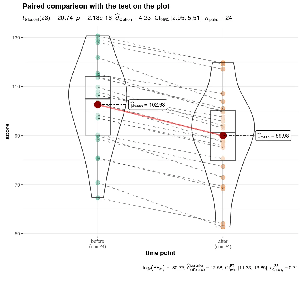
Each grey line joins one subject across the two time points, so the consistent
downward slope is the finding, not the spread of the baselines. The subtitle
reads t[Student](23) = 20.74, p = 2.18e-16, d[Cohen] = 4.23, 95% CI [2.95, 5.51], n[pairs] = 24. Run by hand, the paired test gives t = 20.7435, df = 23, p = 2.179e-16 on a mean within-subject drop of 12.65 with SD 2.99. The
effect size is enormous because the denominator is the SD of the differences,
which is small when every subject moves together. That is the paired design
doing its work, and it is why the same data analysed as two independent groups
would understate the effect badly.
One sample: gghistostats
Section titled “One sample: gghistostats”The one-group case asks whether a single distribution sits where a reference says it should. Here the treated biomarker arm is tested against 12, the control mean, so the question is whether treatment moved the distribution off the control level.
gghistostats( data = twogroup[twogroup$group == "treated", ], x = biomarker, type = "p", test.value = 12, # the reference: the control mean effsize.type = "d", bf.message = TRUE, binwidth = 0.8, xlab = "biomarker", title = "One sample against a reference value")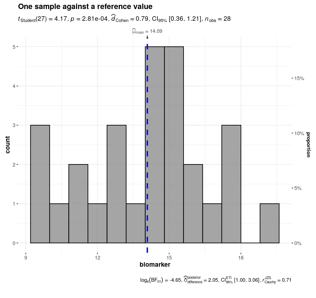
The vertical line marks the reference. The subtitle reads t[Student](27) = 4.17, p = 2.81e-04, d[Cohen] = 0.79, 95% CI [0.36, 1.21], n[obs] = 28; run by
hand, t = 4.1715, df = 27, p = 0.0002808. The treated distribution sits
clearly above the reference, and the Bayes factor caption (log[e](BF[01]) = -4.65) favours that shift. The one-sample test is the right shape whenever the
comparison is “against a known value” rather than “against another group”.
Correlation: ggscatterstats
Section titled “Correlation: ggscatterstats”For two continuous readouts the question is whether they move together. The fixture is a panel of pathway readouts on 60 samples, and MAPK and PI3K share a common driver, so they correlate strongly. Marginal histograms show each variable’s own distribution beside the scatter.
panel <- read.csv("fixtures/pathway_panel.csv")
ggscatterstats(  data       = panel,  x          = MAPK,  y          = PI3K,  type       = "p",  bf.message = TRUE,  marginal   = TRUE,           # histograms on the axes  xlab       = "MAPK",  ylab       = "PI3K",  title      = "Correlation with the test on the plot")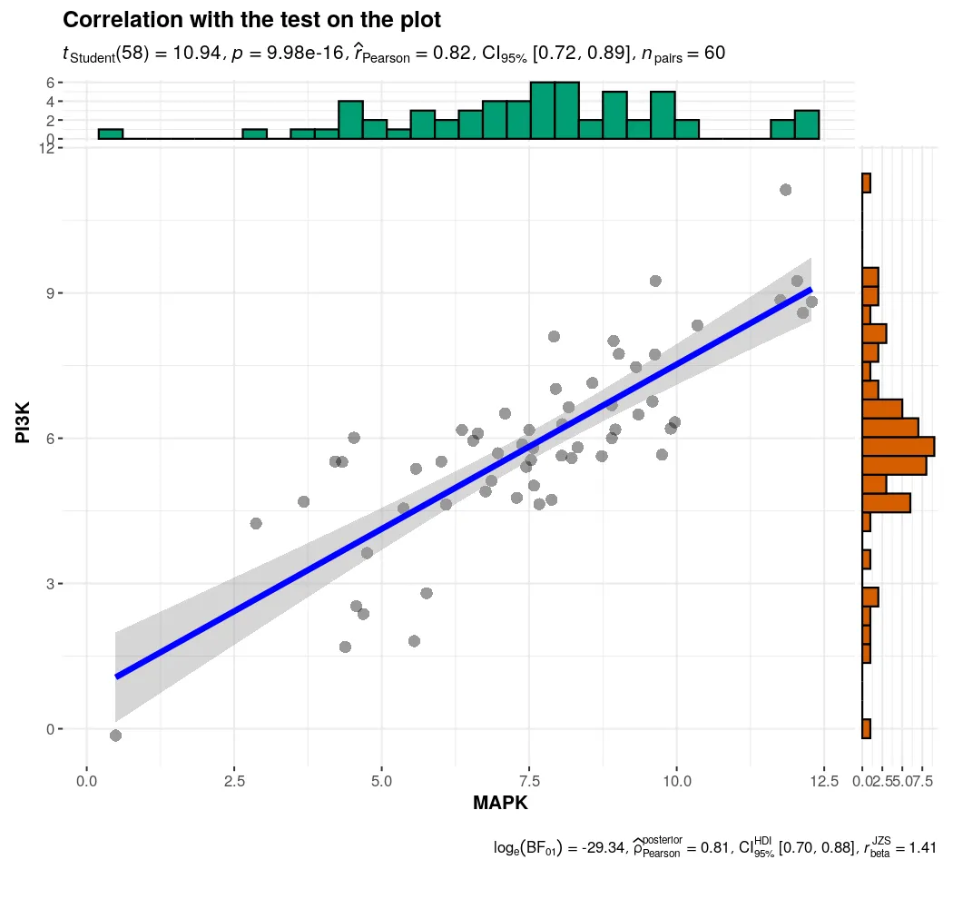
The subtitle reads t[Student](58) = 10.94, p = 9.98e-16, r[Pearson] = 0.82, 95% CI [0.72, 0.89], n[pairs] = 60; run by hand, r = 0.8207, p = 9.98e-16.
The interval [0.72, 0.89] is the part to report: not just that the
correlation exists, but that it is strong and well bounded. The
correlation guide teaches the test itself;
this is the figure that carries it.
A correlation matrix: ggcorrmat
Section titled “A correlation matrix: ggcorrmat”One scatter per pair does not scale. With several readouts the matrix shows every pairwise correlation at once, with a per-cell significance test. The panel’s first three readouts move together through the shared driver; the fourth is independent noise, so the matrix separates them.
ggcorrmat( data = panel, type = "p", title = "Correlation matrix with per-cell tests")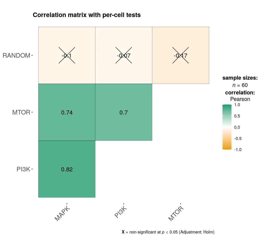
MAPK, PI3K and MTOR form a correlated block. The RANDOM column is crossed out,
which is ggcorrmat’s mark for a cell that is not significant at 0.05: MAPK
against RANDOM is r = -0.10, noise. The matrix is how you read the structure
of a panel before deciding which pairs are worth a scatter.
Proportions: ggbarstats
Section titled “Proportions: ggbarstats”For count data the question is whether a proportion differs across groups. The fixture is responder status by arm, 40 patients each, with the treated arm built to respond more. ggbarstats takes the data in long form, one row per patient, and does the counting itself.
resp <- read.csv("fixtures/response_counts.csv")resp$arm      <- factor(resp$arm, levels = c("control", "treated"))resp$response <- factor(resp$response, levels = c("responder", "non-responder"))
ggbarstats(  data       = resp,  x          = response,  y          = arm,  type       = "p",  bf.message = TRUE,  xlab       = "arm",  ylab       = "proportion",  title      = "Proportions with the test on the plot")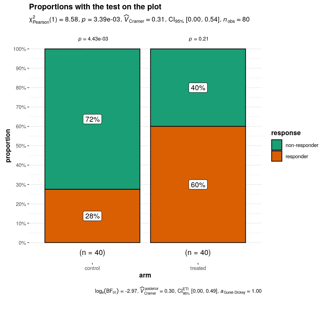
The bars show the treated arm’s higher response share, 24 of 40 against 11 of
40 in control. The subtitle reads chi2[Pearson](1) = 8.58, p = 3.39e-03, V[Cramer] = 0.31, 95% CI [0.00, 0.54], n[obs] = 80. A hand chisq.test on
the same table gives chi2 = 7.31, df = 1, p = 0.0068: the plot applies a
continuity correction and the hand line here does not, which is why the two
statistics differ while the conclusion does not. Cramer’s V is the effect size
for a table, the analogue of Cohen’s d, and the page’s reason for showing it
rather than the p-value alone. The categorical data
guide teaches the test.
When to reach for it
Section titled “When to reach for it”ggstatsplot is the right call when the figure is the argument and you want the
test, the effect size and the Bayes factor on it without assembling the pieces.
The trade-off is control: the layout, the test selection and the annotation are
the package’s choices, so when a journal or a reviewer wants a specific bracket
or a different post-hoc, the ggpubr + rstatix pages in this section give
you the pieces to build it by hand. Use ggstatsplot to report, and the
hand-built pages when you need to dictate the details.
The runnable code and both fixtures live in the companion code repo under
guides/figures/ggstatsplot/, run in the ggstats image.